As Gen Z moves into their first apartments and homes, many are entering the realm of free expression when it comes to home design. No longer beholden to their parents’ aesthetics, Gen Zers are now adorning their own spaces and creating their own unique look.
While this aesthetic is ultra trendy on TikTok, some of its characteristics may be going out of style as home design shifts in 2024. Trends that took off among this generation in 2020 are slowly turning into fads. Here’s what you need to know.
What is Gen Z home design?
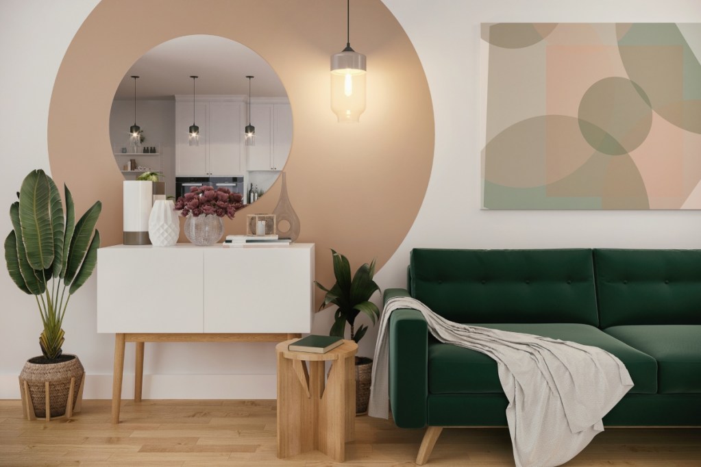
Maximalism has a new branch in interior design. This offshoot has been aptly named “the Gen Z aesthetic,” popularized by Gen Zers moving out of their parents’ homes and decorating their own spaces.
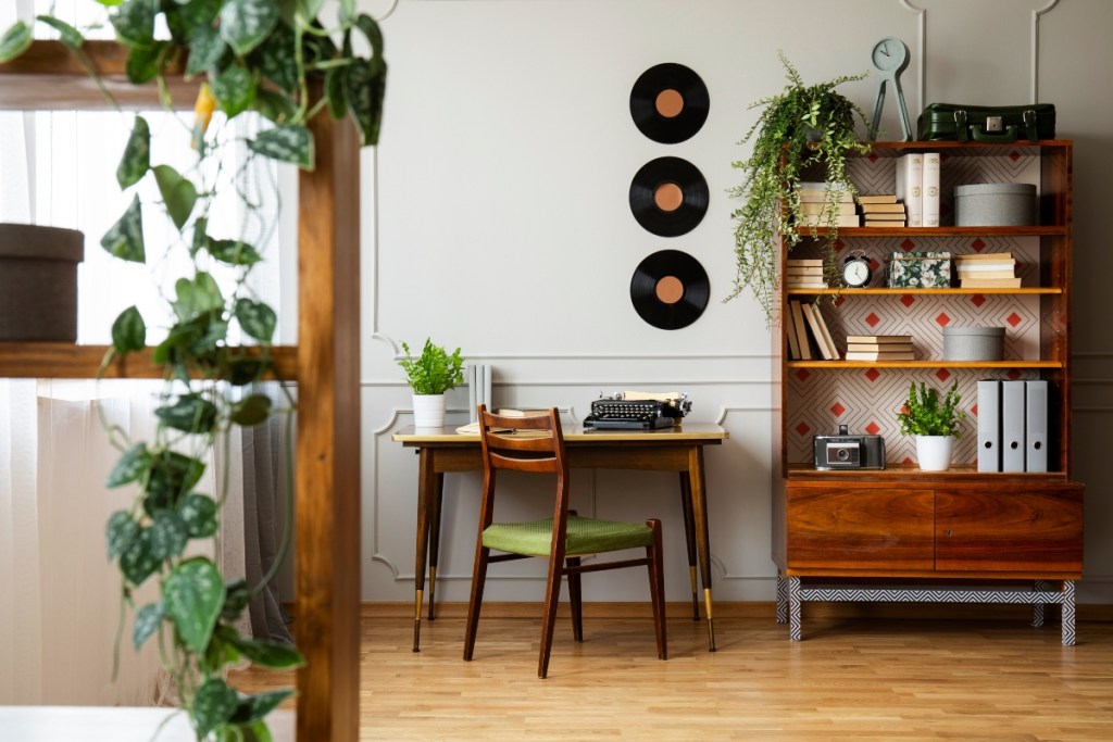
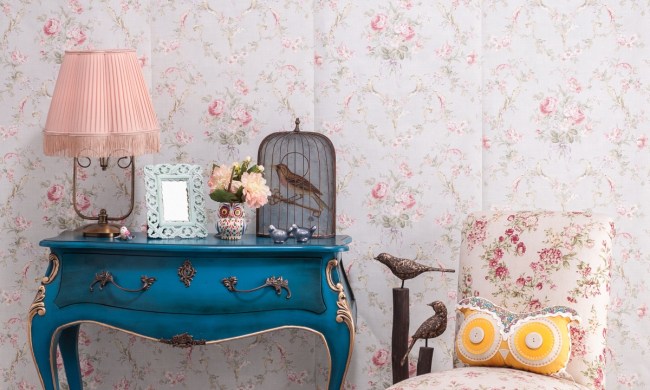
Gen Z’s home design reflects the generation’s craving for color after millennial minimalism dominated interiors for the past few years. Additionally, the Gen Z aesthetic prefers more eclecticism and retro decorum in opposition to the matching sets and modern looks their parents favored.
Characteristics of Gen Z interiors
The Gen Z aesthetic is a broad term that covers the umbrella of Generation Z’s move into interior design. While some decor opinions differ, a few key characteristics have garnered a lot of popularity.
These characteristics include:
- Rounded furniture
- Bright colors
- Bold patterns
- Pastels
- Squiggle mirrors
- Mushroom decor
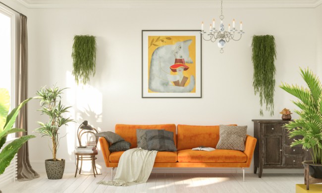
- Lots of plants (both real and fake)
- Tiled tables
- Disco ball decor
- Asymmetrical gallery walls
- Checkerboard prints
- Bean bag chairs
- Cowboy, cactus, and Western motifs
- Cow print
Is Gen Z home design becoming a fad?
While Gen Z aesthetics began gaining popularity in 2020, many of the trends that wound up in this generation’s interiors are slowly losing favorability.
Many TikTokers users, the platform that skyrocketed this home design aesthetic, have begun comparing certain Gen Z style choices to outdated versions of millennial decor. For example, some claim that Gen Z’s cow print is equivalent to millennials’ zebra print. Or Gen Z’s interest in cowboy boots and Western decor is similar to millennials’ interest in monocles, top hats, and mustaches.
This article from The Guardian describes how some Gen Z trends are turning into fads, reminding many of the outdated trends millennials have now abandoned.
“Remember when young people were obsessed with pineapples,” The Guardian said, “Now, mushroom-shaped everything is having its day.”
Below is an in-depth look at some of Gen Z’s outdated home design trends.
Checkerboard print is the new chevron
Checkerboard print may be one of the first Gen Z home characteristics to go. While many TikTokers found the pattern to be fun, quirky, and nostalgic, it’s quickly becoming kitschy in home design. Often featuring pastels and wavy lines, the checkerboard pattern has taken on a unique spin thanks to Gen Z. However, the print is beginning to feel overused and too manufactured.
“Such a distinctive look reminds me of the chokehold chevron had on millennials not too long ago, and it makes me worry about how quickly the checkered pattern will fall out of style,” The Business Insider said.
Mushrooms are Gen Z’s version of the millennial pineapple
Mushroom decor remains in many home design shops since it became a staple of Gen Z interiors. From mushroom lamps to pillows, images of fungi can be seen on nearly anything you can imagine. Likely stemming from Gen Z’s fixation on cottagecore, the mushroom became as popular with this generation as the pineapple did with millennials.
“I know it had its run, but I don’t think it did what you wanted it to do,” said mildsauceshane on TikTok.
People are turning to earthy tones over bright colors or pastels
Home design in 2024 is turning to earthy and neutral colors rather than bright hues and pastels. Gen Z was well known for its pastel walls and furniture. Pastels were light, soft, and fun. For some Gen Zers, brighter colors entered the home to counter beige, gray, and white from the minimalism era. However, these bright colors were often overused and quickly became overwhelming.
Tiled tables aren’t the most practical
Tiled tables were a fun DIY project for Gen Z. It was a simple renovation that many young adults could participate in as a gateway to grander home design renos. However, the tiled tables, though nostalgic, weren’t very practical.
The Business Insider said, “The little pedestals are interesting as a statement piece, but the impractical nature of having a heavy tile and grout block without drawers as a side table baffles me.”
What Gen Z home design trends will we continue to see?

While many Gen Z trends are fading, some characteristics will likely remain for the rest of 2024.
Experimental colors
Pastels and bright colors were used excessively in the Gen Z aesthetic. While this was overwhelming, the intention was to combat the beige and bland decor of the prior decade. Moving forward, we will still see an experimentation with color. However, people will move toward more earthy and natural hues paired with luxe jewel tones and metallic accents.
More plants in the home, but styled intentionally
Biophilic design is ultra trendy right now. While Gen Z loved bringing more biophilia into their spaces with house plants, they went a little overboard. Nick Lewis on TikTok said, “I think plants are great, but honestly, some of these spaces … once you start to add in a bunch of plants, they start to consume the space and take away from the other design elements in your home.”
Moving forward, we can expect to see more sophisticated and intentional styling of plants in Gen Z interiors.
Eclectic, vintage, and handmade pieces
Gen Z made many moves toward reinventing retro and vintage aesthetics. From the tiled tables to checkerboard prints, Gen Z led the resurgence of vintage aesthetics into the home. While some of this mixing and matching became too youthful and kitschy for some older generations, we can anticipate a similar move toward more eclectic and handmade pieces styled in subtle, more organic ways.
Each generation has a unique style that they participate in as they enter the realm of home design. With the ability to decorate their interiors as they see fit, it’s no wonder that many Gen Zers dove right in to make their mark on home design. While they may have gone overboard, leading to some fads, many trends have paved the way for new experimentation in today’s interiors.
