Looking for a way to make your space unique? Is your design feeling a bit, well, dull? Have you ever considered trying a new wall color combo? Paint is one of the easiest ways to makeover a space, and by using two colors, your room will have an original design that is anything but boring. Here, we share our ideas for color combinations that will transform your space from standard to sensational.
Color schemes we love
Before you begin, consider which technique will suit your style best. There are several ways to bring two-toned walls into a space, so make sure you have the lingo down when doing research and planning out your paint job.
- Ombre is when one color slowly fades into another and works well in a modern or boho aesthetic.
- Wainscoting is a classic look and can be applied to the wall’s lower half. Simply paint the wainscoting in one color and the wall above in another.
- Graphic designs allow you to be creative and tailor a room to your individual taste. These can be done using stencils or painters’ tape on a single feature wall or throughout a space.
Once you have decided on your preferred painting technique, it is time to choose your colors. Perhaps the biggest influence on how a room feels is the hues you use. What do you want it to say? Are you looking to create a soothing space or one that energizes? Generally speaking, colors on the warm side of the color wheel— red, orange, and yellow—work well in social spaces because they evoke a cozy, welcoming energy. Cool colors—blue, green, gray, and purple—bring feelings of clarity and serenity. Mixing warm and cool colors is one way to bring interest to your design; just be sure there is a balance between the two. These are some of our favorite combinations.
Pink and yellow
This combo is ideal when you are looking to make a room fresh and lively. Think of summer afternoons filled with lemonade and watermelon, and you get the idea. We especially love pink and yellow bedrooms for a space that feels saturated in springtime hues. You can use soft shades of these colors in an ombre application to create a sunset effect. Take your inspiration from a pink-hued evening sky.
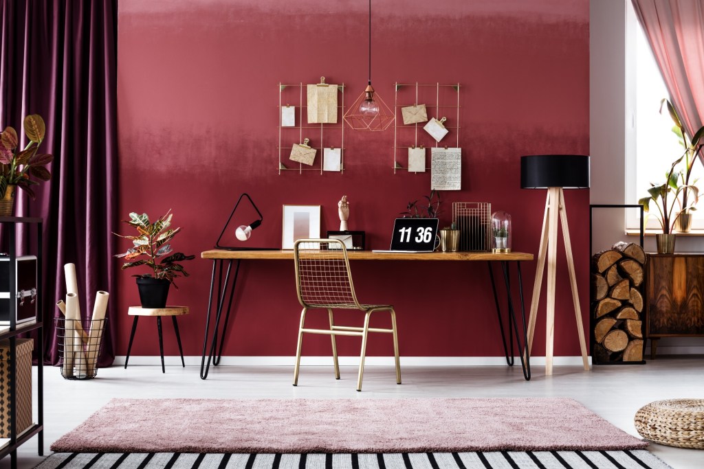
Red and cream
Red is a strong color, but when paired with white, it can look cold. A cream brings out the warmth in this fiery hue. Red is a social shade that works well in common spaces where you entertain, such as living and dining rooms.
Yellow and indigo
Some color couplings are classic for a reason—because they just make sense. What is it about blue and yellow? Maybe it invokes the way we feel around the sun and the sea? Use this combo when you want a space to feel peaceful and fresh at the same time. For a contemporary look, try them in a graphic wall design, or for a more traditional aesthetic, paint wainscoting an indigo and walls a soft yellow.
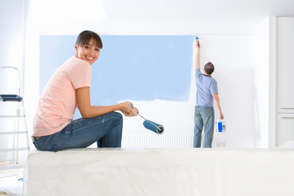
Blue and white
When you want to create a calm feeling, blue and white are a winning combination. An ombre effect with these colors echoes the sky or a tranquil ocean. Done in wainscoting or a graphic detail, the contrast is sharp and strong. Either way, these colors are said to evoke clarity and focus, and they work especially well in bathrooms, offices, and bedrooms.
Gray and white
Are you looking for a serene space that feels like a restful retreat? When considering wall color combinations for bedrooms, gray and white are a go-to pairing for good reason. Combining these will elicit an ethereal vibe and give any room a neutral base that offers flexibility to play with small touches of color in accents and accessories.
Shades of one color
Who says your wall needs to be two drastically different colors? Try using a deep shade of one color and using an ombre technique to have it slowly fade into a lighter shade. This not only gives you a one-of-a-kind wall, but it also makes the design feel grounded and imparts an airiness to the upper portion of the space.
Two-tone color combinations are a fun way to make your room stand out and bring more personality to the design. Whether you are looking to create a private sanctuary or an interesting Zoom background, paint can take any space from just okay to outstanding in a short amount of time.