Low-profile furniture isn’t a new concept, but it’s gaining more popularity in modern and minimalist aesthetics as homeowners crave inventive ways of making their spaces feel cozy and rejuvenating.
However, not everyone agrees that this design idea is worth it. Some argue that it doesn’t make any sense in home interiors and has drawbacks homeowners should know about. To help you decide if low-profile furniture is right for you, we’re weighing the pros and cons to determine if it’s a design trend or a fad.
What is low-profile furniture?

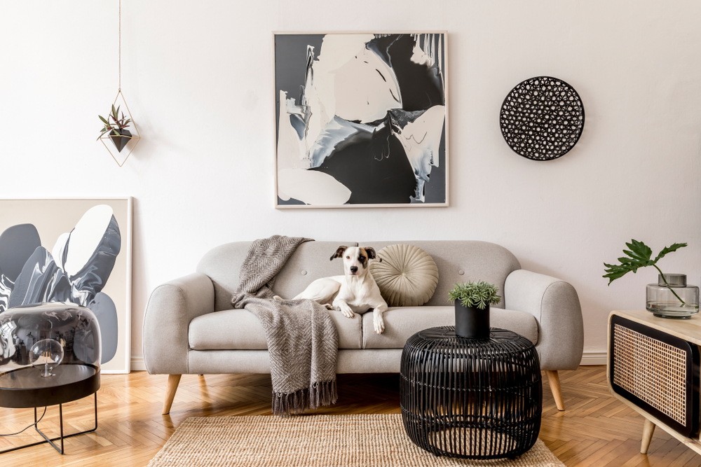
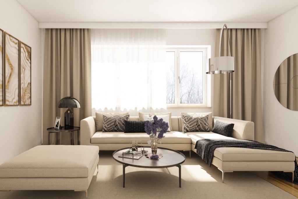
Low-profile furniture sits lower to the ground, typically below 30 inches in height. The average sofa is roughly 30 to 36 inches off the ground, making it an ideal height for sitting with ease. However, some homeowners and designers prefer low-profile furniture that either sits directly on the ground or is below 30 inches from the floor.
This trend is popular in modern and minimalist design aesthetics, where low-profile furniture can enhance a space and impact design. The trend is also gaining traction as sunken living rooms and conversation pits come back into style.
History of low-profile furniture
Low-profile furniture has been popular in Japan for decades now. It’s thought that the concept originated from there or other countries in Eastern Asia. In the 1970s, low-profile furniture became popular again through iconic items like the waterbed or beanbag chairs. Similar to beanbag chairs, low-profile furniture tends to gain more attention every 20 years or so, going in and out of style to suit homeowners’ needs at that time.
Pros of low-profile furniture

There are several reasons homeowners are favoring low-profile furniture in modern homes today.
Can make a room look bigger
One great feature of low-profile furniture is that it can make a room look bigger. When furniture sits low to the floor, this helps make the wall height appear taller. If a sofa is pushed up against the wall, it’s easy to visually see a difference between the before and after. A low-profile sofa allows for more wall space, visually drawing the eye up to the ceiling.
Allows more wall space for decor
Since low-profile furniture creates more visual space for walls, homeowners can add more wall decor or become more creative with their wall decorations. Gallery walls can go lower than hip height to help fill a space. Typically, it’s recommended that decor hangs higher than the furniture. With low-profile furniture, you can gain an extra 10 inches of wall decor space.
Creates a cozy, intimate setting
Low-profile furniture is popular in sunken living rooms and conversation pits because it creates an intimate setting. The lowered furniture can make a space feel more cozy, relaxing, and youthful.
Makes wall features and windows the focal point instead of your furniture
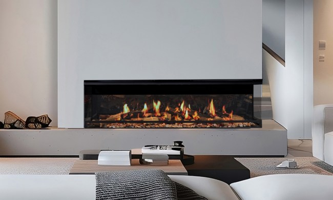
Your sofa or TV stand might dominate the space in a typical living room, becoming a focal point. However, with low-profile furniture, since the silhouettes are lower to the ground, this opens up opportunities to make windows, wall art, and fireplaces the focal point of your space.
Great for kids
If you have young kids and want to make a space more suitable for them, low-profile furniture is great for building independence and encouraging autonomy. Montessori designs often feature low-profile furniture in kids’ spaces.
Cons of low-profile furniture

While low-profile furniture can greatly enhance your home design, there are a few drawbacks critics have pointed out.
Low seating isn’t accessible for everyone
Low-profile seating isn’t accessible for everyone. People in wheelchairs, the elderly, or those with knee complications may be unable to lower themselves to the seat comfortably.
Can make a space feel empty if decor is lacking
Low-profile furniture can leave a room feeling blank if you don’t have large windows or don’t intend to add eye-catching artwork to your walls. Basements, in particular, may feel lackluster or empty with low-profile furniture and inadequate decoration.
Doesn’t make sense in every design style
As mentioned above, this trend is best suited to modern and minimalist designs. French country, rustic, and even midcentury modern designs may do better with hairpin furniture or raised furniture.
How to use low-profile furniture in your home design

If you’re interested in inviting low-profile furniture into your home design, follow these tips.
Keep decor minimal
The point of low-profile furniture is to draw attention to your home’s architecture and wall decor. Keep the amount of seating and table decor to a minimum when working with this trend.
Make a conversation space
This trend was built to be cozy and create an intimate setting. Center your low-profile pieces around a low-profile coffee table to encourage conversation.
Use texture to add dimension
Add blankets, pillows, rugs, lamps, and plants to play around with height. Stagger the levels throughout the room so that your space doesn’t feel monotonous.
Make the surrounding space more impactful
By creating a feature wall or an accent wall or adding impactful artwork, you can draw the eye up in your design. Your low-profile furniture is meant to spotlight other elements in your space.
Low-profile furniture is a unique trend that comes and goes over the years. Recently, minimalists and modernists are favoring this aesthetic. Though with the intrigue of conversation pits and Montessori kids’ rooms, we can expect to see more low-profile furniture in the near future.


