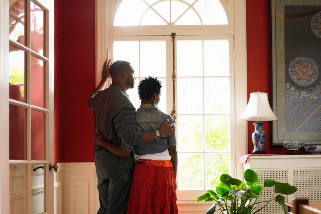
Red is the perfect color for creating a bold statement in your home. It’s luxe, vibrant, and great for adding some personality to your space. Unfortunately, using red in your home design can be tricky. Too much of the color can leave a room feeling overwhelming, and pairing it with incompatible hues creates a design that feels choppy and confused. Today we’re giving you everything you need to know about this magnificent color to help you create a stunning design.
What is the complementary color of red?
When searching for a shade to pair with red, you might immediately think of its complementary color. Using complementary colors in home design is a great way to achieve a cohesive palette with plenty of visual interest. When it comes to red, the complementary shade is green. For some people, it’s easy to associate red and green with Christmas. While the combination of those classic shades can look great around the holidays, it can look tacky in a year-round home design.
However, that doesn’t mean you can’t use both red and green colors in your interior! For example, a dark evergreen can be a lovely wall color to highlight and amplify muted red accent pieces. Alternatively, a subtle and washed-out green can be the perfect pairing for a bright and vivid red tone. To best pair red and green together in a color palette, opt for hues in different tints (a tint is any color that is lightened through the use of white). So, try pairing rich and vibrant shades with lighter, softer tints to create a look that is stunning to behold.
What colors go with red?
Neutral shades
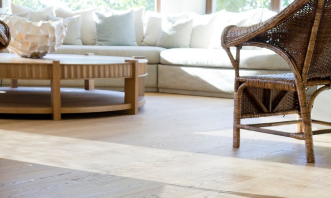
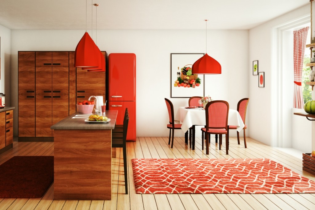
Neutrals are a popular option for homeowners looking to use red in their design. With warm undertones, luxurious browns and creams, and a gentle base for such a bright and lovely color as red, neutrals are one of the best options for building your color palette. Both warm and cool neutrals such as canyon shades, chocolate-browns, creams and off-whites, and grey-tinted colors are wonderful choices to pair with red. Whether you opt for a fiery red tone or a more subtle hue, neutrals can help your red pieces stand out in your design.
Monochromatic tones
Alternatively, monochromatic tones have long been a staple pairing with red. They allow the red to become a feature in any design without softening the look of the space. Unlike neutrals, true monochrome shades — like black, white, and grey — create an edgy look typically found in modern spaces. This color combination is a great way to create a sophisticated look while showing off vibrant red accent pieces.
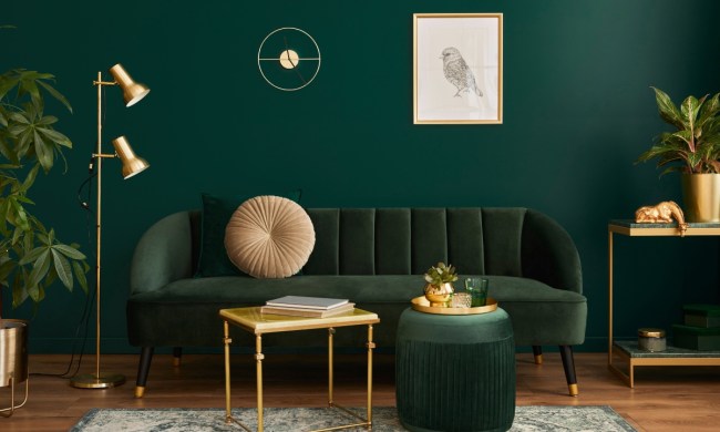
Blue and green
If you prefer more color in your designs, other great color pairings for red are blue and green. Rich, jewel-toned blues are a beautiful color to add to your palette. They cool down the warm tone that red provides and allow you to experiment with color. Additionally, as we mentioned above, dark and muted greens are excellent pairings for red because they add a more natural feel while also allowing the red to shine.
How to use red in your home design
Once you know which colors look good with red, it’s time to implement them into your design. Here are some of our favorite ways to use red in your home.
Use it as an accent color
Red is best used as an accent color in the home. Whether you opt for small red pieces like accent chairs, decor, or side tables, or go grand with red feature walls or kitchen cabinets, it’s best to use the color sparingly to create a curated design. Try to use compatible colors as the base of your design and incorporate smaller elements of red for nice pops of color.
Don’t go overboard
One of the issues many homeowners face when decorating with red is going overboard. Red is a bold color, so in excess, it can feel abrasive and overwhelming. While it’s OK to use red as one of the core colors in your palette, try to use it minimally. However, muted reds or other tints in this hue can look stunning on walls and the ceiling. Just make sure you have some unique and bold furniture pieces to match the attitude this shade will bring to your room!
Pair it with light, muted colors
Muted colors like washed-out blues and greens, monochromes, and neutrals are some of the best shades to pair with red. Bright red, in particular, is best used as an accent color to stand out against these softer backdrops. A muted red room with neutral-toned furniture can also create an alluring space that feels opulent and inviting.
But don’t be afraid to go moody as well
One of the best things about using red in your design is that it is the perfect romantic shade for a moody interior. Pair a rich, velvety red with black or dark grey for the perfect moody suite. Or create a stunning at-home library, office setting, or living space with vibrant red accents alongside black leather. Adorn the room with neutrals and glass decor pieces to prevent clashing. Allow the red to become a splash of color amid a darker setting.
Red is a fantastic color to use in the home, and it can be both exciting and moody. Depending on your color palette, you can create a fun, maximalist dream or opt for something more subtle and modern. If you’re new to using the color or want to experiment with it in your design, we recommend starting slow and first using it as an accent. Once you’ve gained some confidence, try using it on a feature wall, or paint an entire room in this lovely shade!