Neutral colors may be the base of many color palettes and interior designs, but what are they, really? How can we decorate our spaces with these versatile hues? We’ll dive into some of the best color palette tips to help you tackle neutrals like a pro and create a gorgeous interior design, while answering the question: What are neutral colors?
What are neutral colors?

Neutral colors are muted tones with minimal saturation. They are typically soft with a low vibrancy, making them ideal for the base of color palettes. Neutral colors can vary in shade and tint, which allows them to be versatile in any home design. These hues aren’t listed on the color wheel, as they are variations of white, black, and brown. Some neutrals are a blend of these colors, such as beige and gray, which create greige.
Basic neutrals
There are a few basic neutrals that can be turned into other neutrals. Black, white, gray, and brown can be mixed with any other color to create any neutral a person desires. For example, to make taupe, you would combine all the primary colors to make brown and then mix in white to lighten the tone, then add hints of red.
Warm vs. cool neutrals
Adding red or blue to neutrals can make them warm or cool. Warm neutrals will have reddish undertones or more prominent brown hues, while cool neutrals will have blue undertones and lean toward gray hues. Boosting a neutral’s saturation can also increase the warmth, depending on the tone of neutral you’re using.
Pros of a neutral palette
There are several reasons why designers and homeowners alike favor neutrals.
Works with any color and design
Neutral colors work in any design scheme and pair well with other colors. Brown and green, gray and pink, white and red, and black and blue are all examples of neutral pairings with brighter, more saturated hues. Neutrals and their color pairs can become quite complex. For example, slate gray can pair gorgeously with turquoise. Or, soft cream can be stunning with mauve pink.
Additionally, neutrals work with any interior design. Whether you prefer the simple and minimal nature of modern design or favor the rugged and outdoorsy aesthetic of rustic decor, neutrals are a great base for any design scheme.
Easy to build off of
Another reason neutrals are loved so much is that they’re easy to pull off. They make the perfect base for any color palette. For homeowners who aren’t as artistic or don’t have the “design eye,” neutrals allow you to add any color to the palette to create a cohesive design.
Luxe and calming effect
Neutrals are muted tones that have a tranquil, calming effect. They aren’t busy, loud, or over-saturated, as other colors can be like fire-engine red or bold, canary yellow. Neutrals also often appear luxe and sophisticated in any palette, adding a hint of elegance and cohesion to the design.
Tips for decorating with neutrals

If you’re interested in inviting neutrals to your home, we have a few tips to help you pull off the perfect look.
Slowly introduce more color for the perfect look
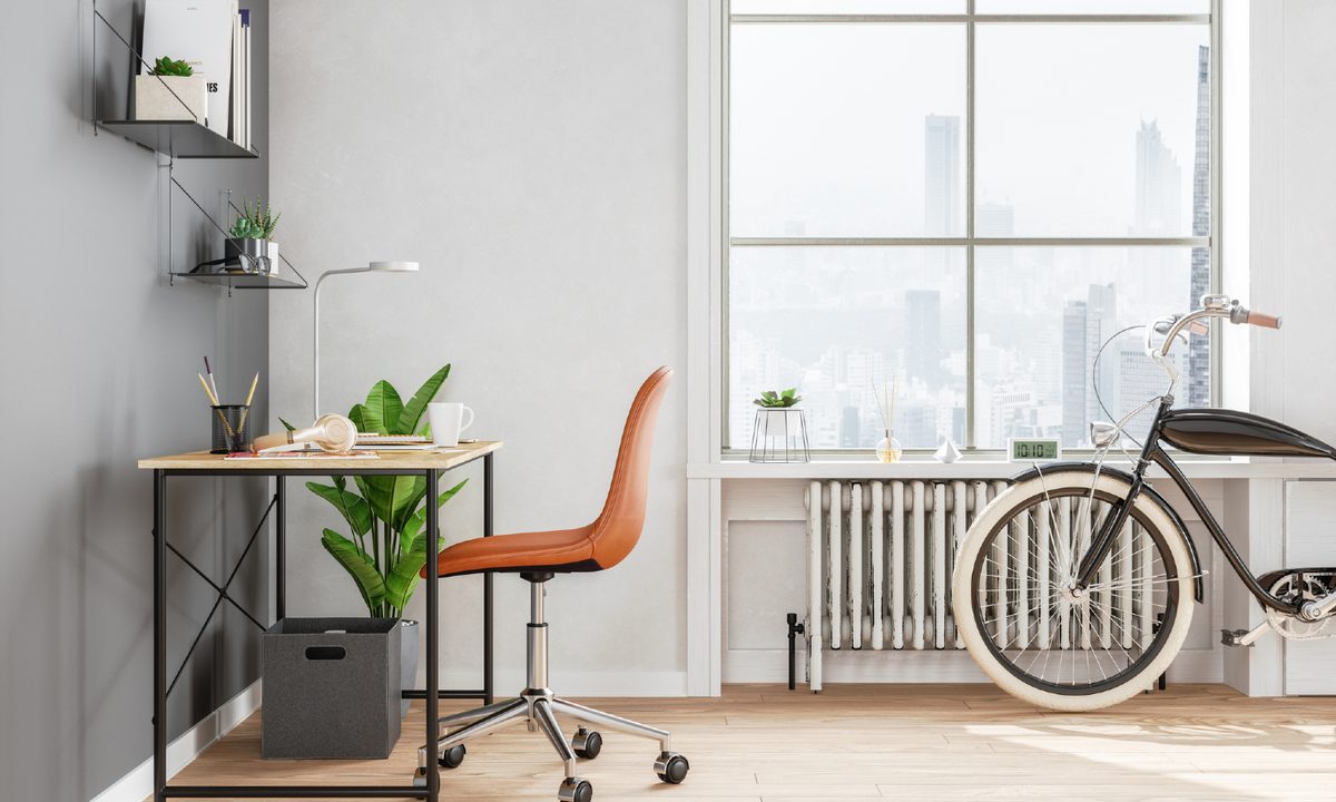
A good design trick is to start with neutrals as a base. Pick a color to be the base of your color palette to offer the perfect backdrop for your design. For example, you might choose eggshell white as your base and paint it on your walls and ceiling. Then, add other colors to your design to introduce more visual interest. You might bring in green through plants, dark gray with the sofa, cream with the rug, and navy blue with an armchair. The neutral rug, sofa, and walls help aid your green plants and blue armchair, allowing them to be accents and focal points within the design.
The key is to introduce color slowly. Pick one pop of color at a time. As we’ve shown above, you can also branch off with other neutrals to create a crisp and soft palette. You might consider using a fun pop of color on the wall, like a rich canyon red, and soften the look with beige furniture. Build the palette slowly and refrain from adding too many bold or clashing colors unless you’re going for a maximalist aesthetic.
Use various tints and undertones
When working with neutrals, it’s a good idea to focus on the tint and undertone of the color you choose. If blue is a feature color in your palette, use neutrals with slight blue undertones to make the space more cohesive. A pale gray with light blue undertones will look more natural against a brighter blue than a warm red-undertoned beige.
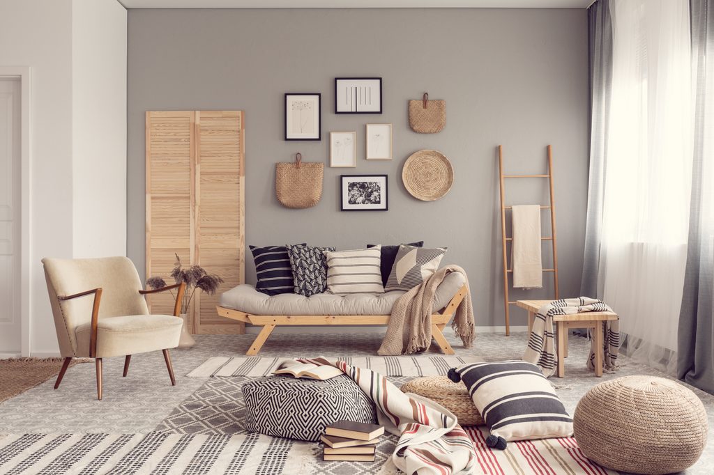
Use texture to vary up your design
Texture will also play a vital role in amplifying the neutrals in your design. If you’re aiming for an entirely or mostly neutral palette, create variation through texture. Sheer white curtains paired with a low-pile white rug will add a bit of visual separation, even if the colors are the same. Be sure to incorporate different tints and shades of neutrals with your textured pieces to create dimension in the space.
Match neutrals when you’re not using them as a base
As you decorate your home, try to match your neutrals if you aren’t using them as a base. For example, a kitchen with light yellow walls might benefit from white cabinets with scattered accents of white or dark wood. However, if you begin to add black and gray accents, the space can feel disjointed. When in doubt, match your neutrals. Are you already using gray as an accent in a space? Limit your palette to varying gray tones for the best cohesion. Then, branch out as necessary.
Neutrals are wonderful tones that help ground any design. They offer a perfect base or backdrop for other accent tones. Additionally, neutrals go well with any design scheme or color palette, making them a versatile choice for homeowners.