Have you ever painted a space and thought it just didn’t feel right, but you couldn’t figure out why? Walls are typically the largest surface in a room, so it makes sense that paint color is sure to have a huge impact. The right hue can make or break any design, but there is more to selecting a shade than whether or not it looks good with a fabric swatch. Certain colors have been scientifically shown to elicit different reactions. Some bring energy and vibrance, while others convey a sense of serenity and calm. Which ones will give your space the vibe you want? Here, we explore the differences to make sure the next color you choose is the perfect match.
Cool vs. warm
Colors fall into two basic categories—cool and warm. No matter if it is a strong or muted shade, the key is understanding which category is right for you. Before selecting, two questions you should ask yourself are what are you trying to achieve with the color, and how do you want the space to feel? The answer to those questions will guide you.
One of the best examples of colors being used to sway emotions is in branding. Think about logos from some of your favorite companies, sports teams, restaurants, and stores. The color choice was not accidental. It is often picked to signify what they want you to think about their brand. Red stands for passion and excitement, yellow sunny and happiness, green growth and connection to nature, blue trust and maturity, and so on. That is pretty powerful.
You probably remember the color wheel from elementary school art class, but you may not remember how it was all laid out. Essentially one side of the wheel is warm colors—red, yellow, beige, orange. The other side is cool—blue, green, gray. Hybrid shades are when colors are mixed together. Some designs mix warm and cool shades, but it will always be the dominant one that influences the room’s personality the most. For a more classic look, stick with either warm or cool in your design, but if you are looking for a funky, eclectic space, mix them to your heart’s content.
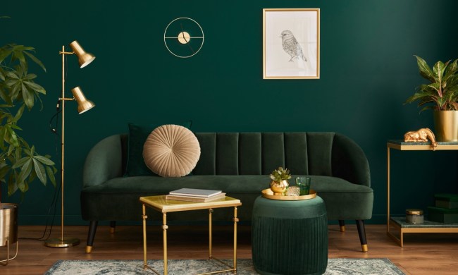
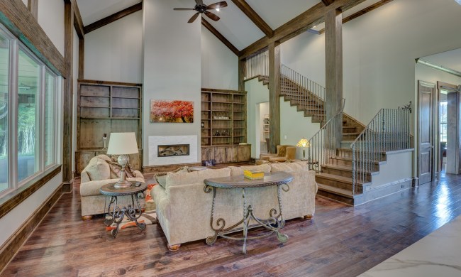
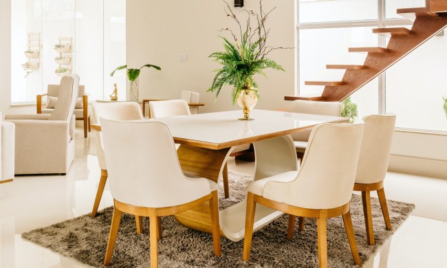
Where warm works
Warm shades are stimulating, so they work best in social spaces. Use them when you want to create a welcoming and cozy room. They are good choices for your home areas where you will entertain guests and come together, such as your living room, dining room, or kitchen. They tend to make rooms feel more inviting and give an intimate, cozy atmosphere.
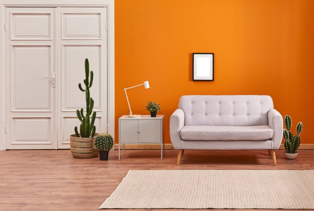
Where cool is best
Cool shades will give a room a sense of calm. They give your mind a chance to relax and bring an air of freshness. Since they promote focus, many people use them in offices, but they also work well in bedrooms and other private spaces. Another bonus is lighter variations of them make smaller spaces feel more expansive.
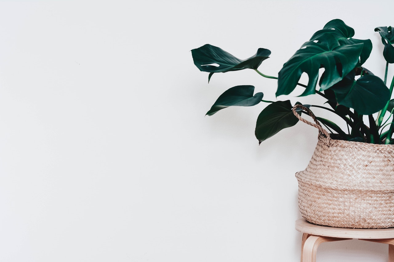
Whites
Technically, white is not a color, but it can still lean warmer or cooler. This is because each shade has certain undertones that lend it to one category or another. For example, you can have white paint with a yellow undertone and one with a blue undertone, and the difference between the two will be quite drastic. Think about a creamy white mixed with other warm colors and a bright white mixed with a striking sapphire shade. Those are two entirely different looks even though they may both be in the white family.
Things to keep in mind
One factor that can dramatically influence paint color is the lighting in the room. The amount of sun, the kind of lights you have, and the position of the room can all influence how it will appear. It is always a good idea to paint a small section and look at it during different times of the day. Warm or cool, this will ensure that it is the right shade for you.
Whether you are looking for a totally new look or a simple refresh, knowing whether you want a warm or cool shade will ensure that your room will feel like home for years to come.