As interior design continues to evolve, it’s no surprise that designers have transitioned to platforms like TikTok to share their design tips and tricks. As a result, TikTok has quickly grown to rival Instagram for the interior design spotlight. With fun and quirky bite-sized videos of designers sharing their favorite trends in an easy and understandable format, TikTok has created a space for homeowners to go to when they require some aid in their next renovation.
One thing DesignTok, the home decor side of TikTok, has to offer in abundance is professional design tips regarding what homeowners should aim to avoid during their next remodel. We’ve gathered some of our favorite ugly interior design mistakes below to help you know what not to do in your next reno project.

Matching the tones and textures of every furniture piece
Designer @homedrawninteriors on TikTok shared their dos and don’ts for designing the perfect bedroom. This designer mentioned in their video the importance of diversifying the colors, textures, and styles of your bedroom furniture. Matching bedroom sets have become outdated, often feeling more like a stale ’90s or early 2000s home design trend. This designer recommends avoiding matching the tones and textures of every furniture piece, especially in the bedroom.
@houseofkatecreates Interior decorating dos and don’ts bedroom edition! #decorating101 #decoratingdos #decoratingdonts #interiordesign #interiordecorating #greenscreen
Instead, try to mix and match different materials and styles to create a more organic and textured look. For example, HomeDrawnInteriors shares a modern bedroom featuring a white textile headboard, a painted side table, and a wicker bench, which gives the illusion of more depth and dimension within the design.
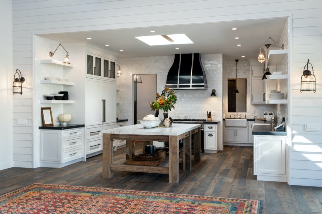
Opting for cheap and cliché modern farmhouse calligraphy wall art
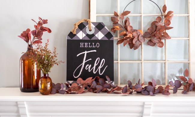
While the modern farmhouse style is a beloved choice for many homeowners, certain design details within this aesthetic have become outdated and tacky. Designer @studiokindesign on TikTok shares their take on interior design mistakes that homeowners should avoid. When it comes to the modern farmhouse aesthetic, cheap calligraphy wall art is a thing of the past. This wall art, often found in big retailers, can cheapen your home design or make your space feel kitsch.
@thirteendesignstudio But this is just our preference ???♀️ #fyp #foryoupage #interiordecorater #interiordesign #interiordecor #designtok #designtiktok #trends
Instead of using this dated 2014 modern farmhouse design detail, @studiokindesign recommends selecting earthy and organic decor. Landscape paintings, pottery and earthenware, tweed materials, and wicker details are better options for lovers of the modern farmhouse style.
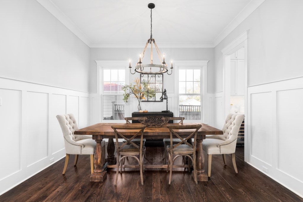
An all-white or stark color palette
The all-white and stark color palette serves a purpose for many home design styles like minimalism or Scandinavian aesthetics. However, this color palette has become misused and often isn’t suitable for design styles where color and pattern can be more favorable. @thegrovehousesocal on TikTok shares their design don’ts, one of which is the all-white palette. The problem with an all-white palette is that it’s easy to create a bland or flat look that feels barren or uninteresting. So @TheGroveHouseSoCal encourages homeowners to opt for a neutral palette that has more depth and texture.
@thegrovehousesocal 2021 Design Trends to Ditch #diy #designtrends #newyear #design #interiordesign #decor #home #EveryKiss
For homeowners who favor white color palettes and aesthetics, we recommend pairing them with some warmer tones like dark brown, cream, beige, or reddish-brown to create an earthy look. Be sure to blend in lots of texture through woven rugs, baskets, stone and metalwork, and glassware to create a design that feels rich and inviting.
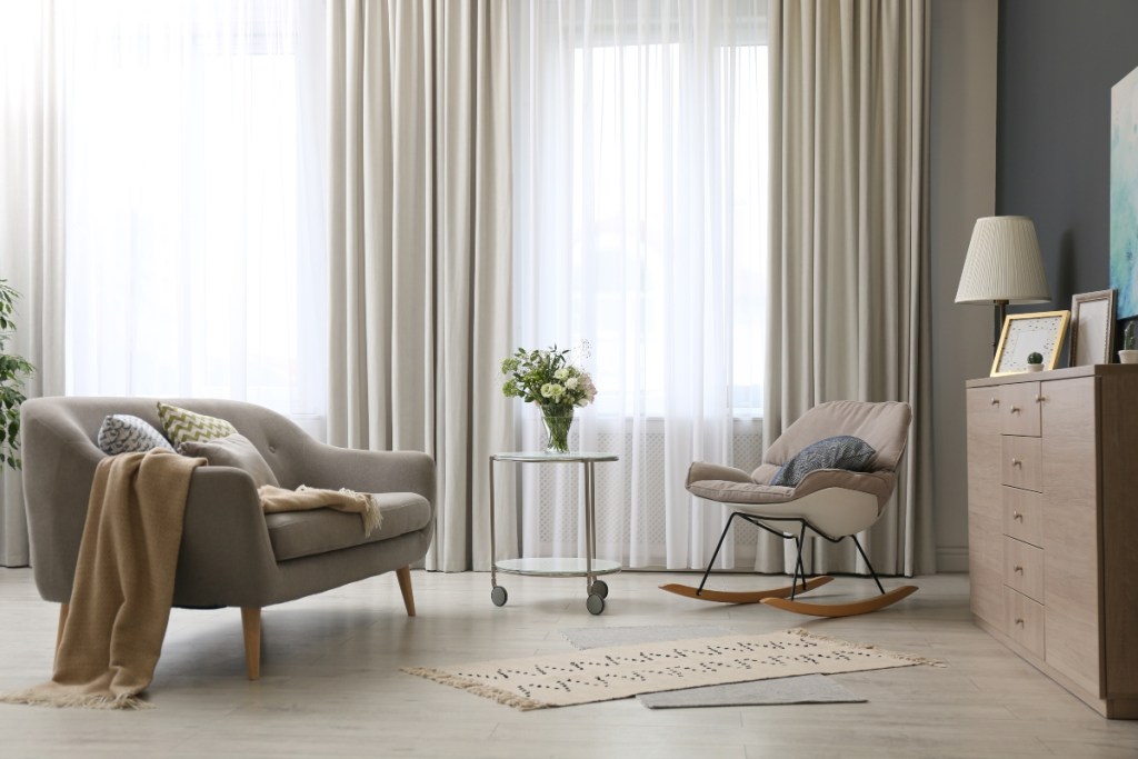
Curtains that don’t go down to the floor
While many interior design fails are often based on personal preference, it’s fairly safe to assume one of the ugliest design mistakes is using curtains that don’t go down to the floor. Many professional designers highly recommend that homeowners avoid this ugly design trend, no matter their design style. TikTok designer @barelykeepingittogether shares their version of interior design mistakes to avoid. Among them is using curtains that are too short to reach the floor.
@barelykeepingittogether Interior Design Mistakes to avoid! #interiordesign #interiordecor #interiordesignmistake #homedecor #designmistake #interiordecorating #foryourpage
As a general design rule, homeowners should suspend curtains from about six inches above the window frame and then allow the fabric to “kiss the floor,” as @BarelyKeepingItTogether states. This will create a more elegant and luxe look within the home and prevent your design from feeling unfinished.
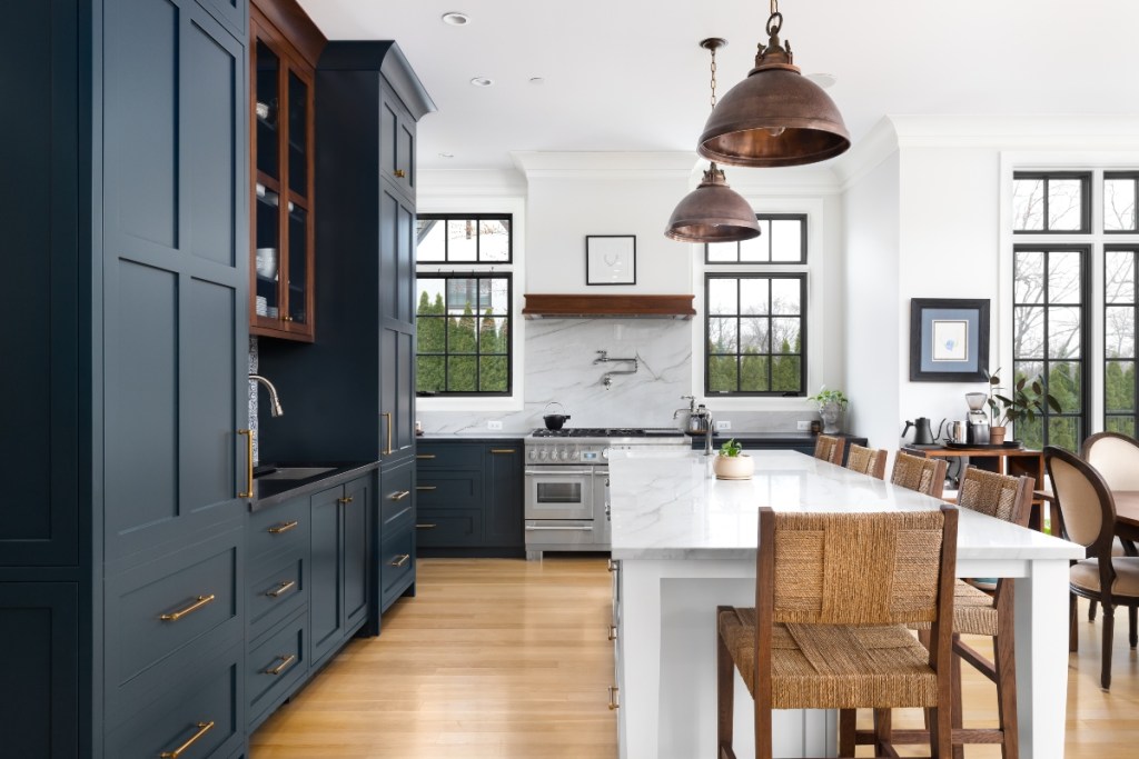
The outdated ‘kitchen triangle’
If you’re undergoing a kitchen remodel or considering changing your kitchen layout, you might have heard about the “kitchen triangle.” This is a term used to describe the layout between the sink, stove, and refrigerator. For many years, the kitchen triangle was a fantastic way to design a kitchen to enhance the experience of a single cook. However, just as designer @prestonkonrad mentions in their TikTok video, home design has transitioned to a more community-like feel for the kitchen space.
@prestonkonrad Do you love or hate a kitchen triangle? #greenscreen #homehacks #kitchenhacks #kitchendesign #kitchendecor #homerenovation #diyproject #diykitchenremodel #kitchenmakeover #interiordesign #interiordecor #kitchenlayout #hometips #homediyproject
♬ Say So (Instrumental Version) [Originally Performed by Doja Cat] – Elliot Van Coup
Instead of using the kitchen triangle method, @PrestonKonrad encourages homeowners to choose a kitchen layout that promotes a workspace feel. More room for movement and large tables or ample counter space for food prep is ideal. As you go about your kitchen renovation, consider how your layout will better benefit a team cooking environment. (Of course, if there’s only one chef in your home, the kitchen triangle design still works.)
Say goodbye to gray wood floors
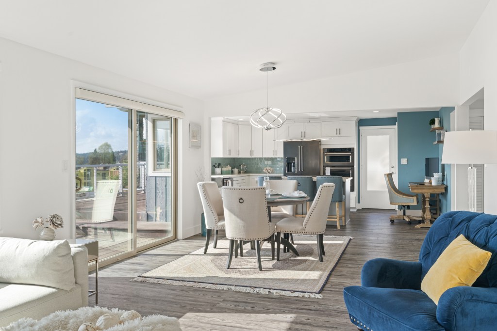
The days when gray, greige, and white tones ruled the home are slowly fading. Today’s homeowners and designers crave warmth and vibrancy with more natural and organic elements. This means there isn’t much room for the cheap and cold look of gray wood flooring. Designer @jordansamsondesign on TikTok points out that this flooring doesn’t look natural, making it difficult to style. Additionally, the cool undertones present a unique challenge when creating an organic and vibrant color palette.
@jordansamsondesign Now which are your least favourite? #interiordesign #interiordesigntrends #homedecor #interiordesignideas
If you can afford to revamp your outdated flooring, choosing a richer and warmer wood would better suit today’s style trends. Alternatively, lighter woods with a more natural and prominent grain can also be an excellent choice for homeowners looking to spruce up their spaces. However, if you’re renting or unable to undergo a renovation at this time, pairing hues like evergreen, deep brown, mauve pink, or cream with your gray flooring will help breathe life back into your space.
At the end of the day, you should always decorate your home in a way that fulfills you. If you adore any of the aforementioned design trends, there’s no need to completely remove them from your home. That said, we would recommend pairing these trends with some of the alternatives given for a more modern touch in your home design. However you plan to decorate your space, you can always rest assured you’ll find plenty of inspiration from the experts and the design gurus of TikTok.

