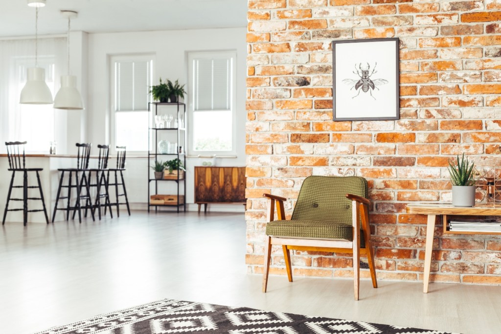
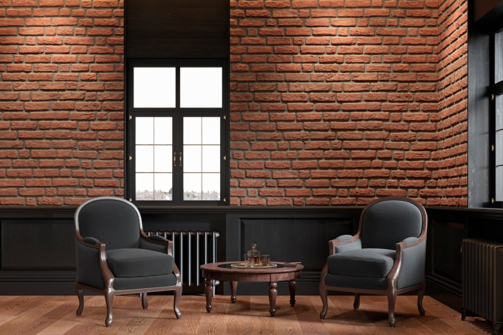
Exposed brick adds a warm and cozy touch to any space, using natural materials to soften the synthetic trappings of a modern-day home. While it’s most common in rustic and industrial styles, exposed red brick is also prominent in traditional and farmhouse aesthetics, where it adds a bit of character to the room. Unfortunately, choosing the right paint color to pair with your exposed brick can be challenging.
For example, a shade that is too stark could make your exposed brick look kitschy and out of place, while a dark hue might make your exposed brick appear dull. So, to help you find the best paint colors that complement red brick, we’ve gathered a few tones that are sure to make your feature wall pop!
Is red brick out of style?
Like many types of masonry, red brick is a timeless addition to the home that never goes out of style. That said, not all exposed red brick aesthetics are the same. For example, darker red bricks with brown undertones were a popular feature for fireplaces or brick walls in the mid-century. This darker, more neutral style replaced the previously trending bright and vibrant red bricks that were challenging to decorate with. In recent years, washed-out, weathered brick styles have gained popularity, particularly in modern farmhouses where understatement is key.
While certain brick colors have gone in and out of style, natural red brick has remained a constant and timeless home feature.
What colors go with bright red brick?
While red brick adds a rustic and warm touch to a space, it can be challenging to blend it into an existing design. Fortunately, there are a few fan-favorite colors that will complement your red brick, regardless of the aesthetic of the home.
Navy blue
This deep shade adds an elegant and modern touch to a room and ensures the red brick makes a statement. For the best look, we recommend pairing navy blue with washed-out red brick with tan and brown undertones, as the contrast between the blue paint and red brick adds more depth and dimension to the room.
Additionally, consider how dark your brick color is before purchasing any paint cans. For example, navy blue is best suited for more muted red brick tones, preventing the room from appearing too dark and moody. Playing with light and dark shades alleviates the heaviness associated with darker colors to make for a more inviting space.
Gray or greige
Gray and greige are excellent complementary paint colors for a room with vibrant or dark brick, a material that can appear gloomy with darker paint colors. However, light gray or greige adds a touch of brightness, and the neutral tone brings a sophisticated and modern element.
Further, the brown undertones of the brick will bring out the brown or tan undertones of the greige to create a warmth that’s especially welcome in a living room or den. In terms of the rest of the decor, try to keep things simple and refrain from accent walls. Instead, let your brickwork become the eye-catching feature of your design.
Yellow or orange
For maximalist and contemporary designs, a bold yellow accent wall beside dark exposed red brick makes a great impact. The striking contrast is exciting and energetic, showing off your fun-loving personality. To create a more muted version of this citrusy color scheme, opt for tangerines, yellows with orange undertones, orangey-reds, or pastels. Bright colors are refreshing, but they can also be an eyesore if there are too many of them. Ensure your design is still pleasant to look at by incorporating creams or off-whites to balance the bold hues.
How do you make red brick look modern?
Brick is a traditional material that’s reminiscent of old schoolhouses and stately fireplaces. To bring this feature into the 21st century, pair it with white, off-white, beige, or light gray. These simple neutrals can brighten the space, and the minimalist approach transforms the exposed brick into an envy-inspiring statement piece. Additionally, modern design is all about lightweight materials so, since exposed brick can appear dark and heavy, be sure to include daintier accents like breezy curtains, glass side tables, and simple picture frames.
Whether you live in a renovated loft or brand new home, exposed red brick adds a touch of character and history to a home, harkening back to stoic 19th-century buildings. Make the most of this feature by filling the room with colors that allow it to shine. Play around with minimalism by using a neutral or light-toned backdrop, or embrace your bohemian side and experiment with vibrant accent colors like yellow, and orange. All in all, the name of the game here is balance. As long as you offset dark tones with light hues and heavy material with light furnishings, your red brick feature will be the most-talked-about aspect of your home.