The time has come, and you’re finally ready to embark on your next big project to remodel your kitchen. For a quick project that makes a big impact, consider changing the color of your countertop. While this is a fun project, it’s pretty cost and energy-intensive, so make sure you choose a color that complements your existing space while also inviting a lighter, brighter feel.
With any of our recommendations below, you can create a stunning kitchen that reflects the personality of you and your home.

White
White is a simple yet effective countertop color that complements any design style. Though it’s most often used in minimalist designs, it works with a variety of styles. White is clean, minimal, and reflects light to open up the entire space and make it appear brighter. This is also a great option for rooms with dark walls and cabinets or limited natural light as it balances out the dimness and adds a little illumination.
How to style it
White works well with nearly any cabinet color or material, making it the most versatile option on our list. You can also purchase white countertops in stone, concrete, or quartz, depending on your preferences and budget.
To keep things from looking too bland, try to decorate with small pops of color via decorative vases or appliances. Wooden tones can also soften up the starkness of bright white, so consider incorporating natural materials like wicker baskets, wooden stools, or rattan side tables.
What it’s good for
- Minimalists or those who prefer to keep things simple
- Modern and contemporary home designs
- Kitchens with dark-colored cabinetry
- Rooms with dark walls or tiles
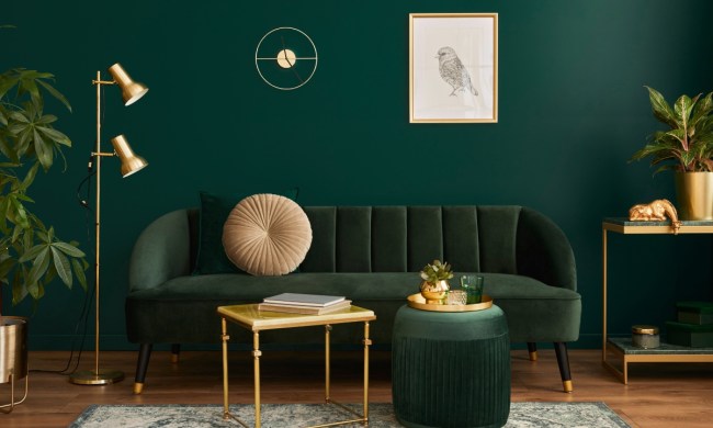
Green
It might sound strange at first, but green was quite a popular countertop color in the mid 20th century. When styled smartly, green countertops bring life and brightness to your kitchen and look especially stunning in traditional or rustic-inspired homes. They also add a fun vintage look that can be retro without appearing outdated.
When it comes to choosing a material for your countertop, the most common option is recycled glass. Not only is recycled glass an eco-friendly option, but it comes in a range of countertop colors, including green!
How to style it
Pair this colorful countertop with white cabinets for a simple and clean look. Other neutrals like black, white, grey, and natural wood are also great pairings.
What it’s good for
- Adding more color to a kitchen’s design
- Vintage and retro styles
- Kitchens with plain white cabinets
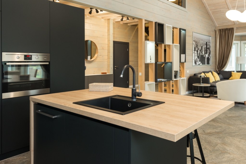
Grey
Grey countertops, especially concrete ones, are definitely on-trend this year. Also available in recycled glass, crushed stone, and slate, this option is full of possibilities. Perfect for modern and minimalist homes, this soft, muted, and classic color creates a clean and streamlined design.
How to style it
If you opt for a sleek, slate-like grey, pair it with warm woods or lightly painted cabinets to soften up the look. Speckled grey countertops look stunning with traditional wood cabinets like oak, cherry, and birch, whereas recycled glass and concrete cabinets do well with light woods, whites, and pastels.
What it’s good for
- Traditionally styled homes
- Kitchens with a neutral color palette
- People who favor granite but want a more affordable option (when using quartz)
- People who love elegant and sophisticated looks (when using marble)
Wood
While wood isn’t necessarily a color, we couldn’t resist putting it on our list! This option is excellent for bohemian, vintage, Mediterranean, and country-styled homes.
Wood countertops, especially butcher block ones, bring warmth and vibrancy to a kitchen space that is any home cook’s dream. Wooden countertops are available in a variety of colors like soft cherry, warm oak, and light birch. The best part is, if you grow tired of the color over time, you can always restain it to create a new look.
How to style it
Wood can round out the hard, straight look of black and white painted cabinets, metal accents, and stonework. Too much wood can make the kitchen look dated, so be sure to upgrade or replace any traditionally styled cabinets.
This texture warms a space up but also invites an element of earthiness, bringing in a little color and texture without opting for anything too flashy and trendy.
What it’s good for
- Bohemian, vintage, Mediterranean, and farmhouse styles
- People who want to add more natural materials to their design
- People who prefer a gentle surface for knives and kitchenware
Picking a new countertop is a big decision, but it’s also easier than many people think. You can’t go wrong with any of these four options, but you should also feel free to experiment with other colors, patterns, and materials. Whether you love modern and contemporary styles or prefer farmhouse and rustic feels, there’s a countertop solution for you.