Fall aesthetics have changed over the last decade, from the classic orange and yellow theme to modern white with a hint of faded color. These days, designers are looking to reintroduce color with a twist. Diverging from the typical palette we often associate with the autumnal season, colors with more eclecticism, vibrancy, and naturality are quickly entering the interior landscape.
So what colors are trending this fall? Below, we’ll share some of the best hues to decorate your space this season to create a stunning fall aesthetic.
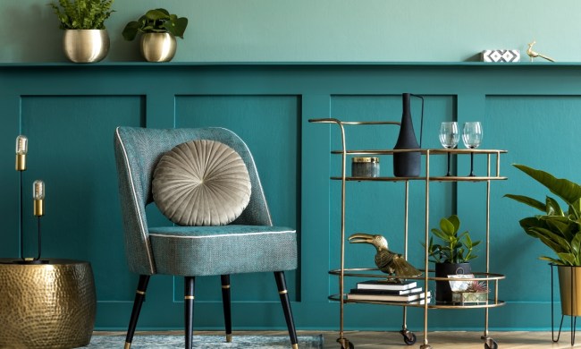
This year, it’s all about olive tones
It should come as no surprise that olive green is trending this season. Green was named the color of the year for 2022 by some of the biggest names in the paint industry. Now, as summer comes to a close, this hue is paving its way into fall decor. Sherwin-Williams color of the year, Evergreen Fog, is the perfect shade of olive to invite into your space.
Green breathes life into its environment. And while many leaves are changing or falling outside, there’s something refreshing about this lively hue in the home. Olive tones, in particular, are a perfect way to cling to the inspiring effect of green without the color clashing with your autumnal decor. Try to surround your pumpkins and fall ceramics with lovely olive sprigs. Or, adorn your mantle with an olive-toned vine.
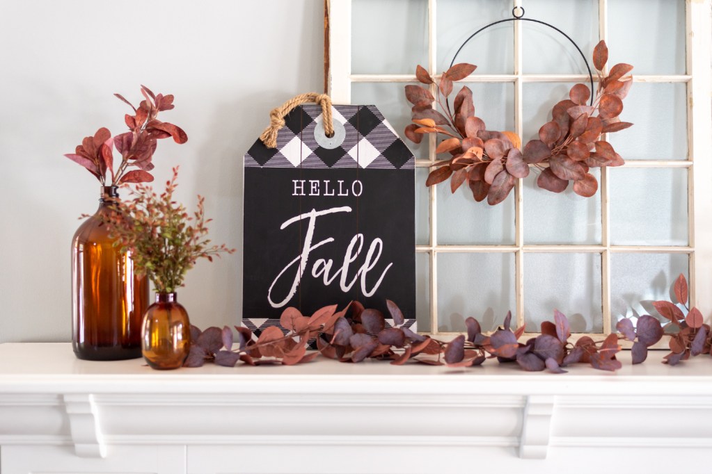
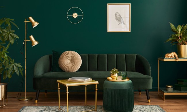
Plum and wine shades are trending
As we mentioned above, trends in fall home decor are shifting. Gone are the days of the simple yet classic fall palette. Now, many designers are leaning into trendy jewel tones to create refreshing and inspiring looks.
Plum and wine shades have easily entered the home this season. From painted cabinets, wall accents, throw pillows, and lush, vibrant decor pieces, these rich purple hues create an elegant and unconventional addition to fall home design. The velvety hues look best alongside the modern white fall aesthetic and with the aforementioned olive tones that are increasing in popularity this season.
For inspiration on what plum and wine shades look best, we favor Sherwin-Williams’ color Blackberry and Glidden’s Deep Plum. Both colors are luxe and vibrant, perfect for creating a moody and cozy atmosphere in your home this fall.
Try navy blue for a soothing space
Navy blue has also garnered some attention this season. Typically found in winter color palettes, this shade has slowly transitioned into fall color schemes as well. Navy blue is rich, deep, and organic. It’s the perfect accent tone for an eclectic fall palette. Paired alongside pale oranges, olive tones, and many shades of white or cream, navy blue creates a striking look in any space.
Many farmhouse styles have begun to incorporate this color in their fall schemes. Blue table runners and placemats adorn the dining table while painted blue pumpkins rest beside delicate chinoiserie. If you’ve already added blue and white ceramics to your China cabinet, try bringing out this stunning detail in your design by inviting navy blue into other areas of your space this fall.
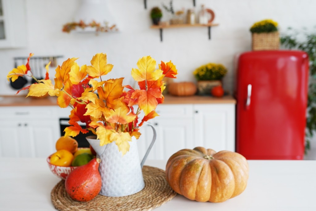
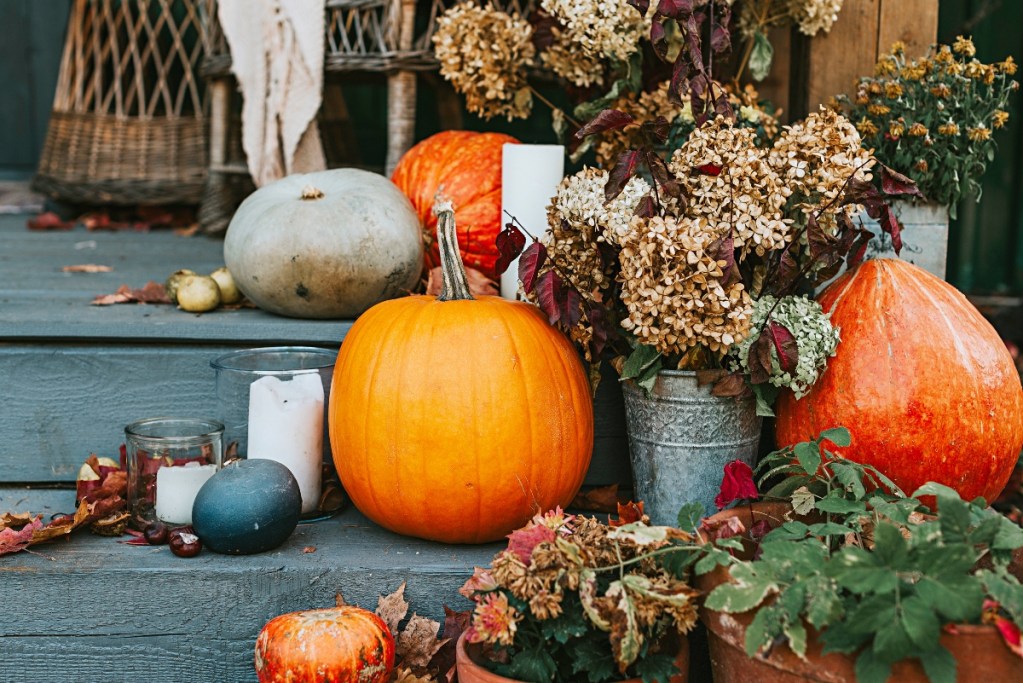
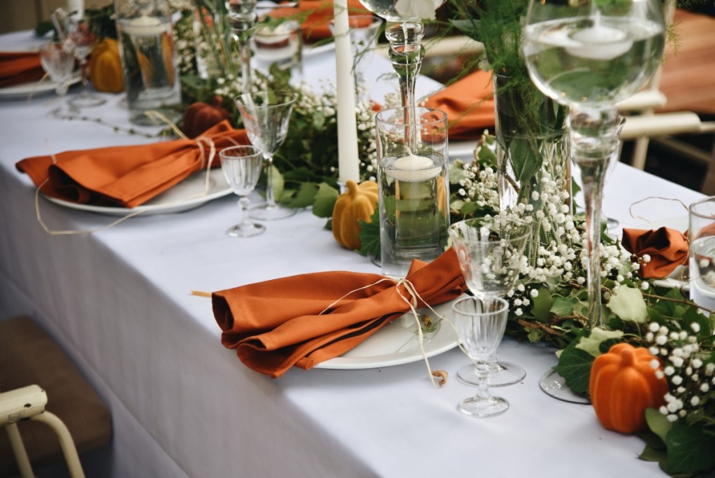
Orange is a must-have
Bright orange has been a must-have in fall decor for quite some time. But these days, designers are shifting their attention to more muted and moody tones. Colors come in many shades, and orange is no exception. Pale and muted oranges with more white and creamy undertones are a fantastic addition to a modern fall color palette. Alternatively, many designers are also gravitating toward darker oranges with deep, black undertones.
Fall Foliage by Behr is a great example of a darker orange shade. Slightly muted and full of depth, this color is perfect for those who favor classic fall design but desire more sophistication in their decor.
Clay-colored hues offer a natural feel
Clay-colored hues have been popular for a few years now, but this is one of the first times we’re seeing it in fall design schemes. This year, people want an organic and natural feel to their spaces. Biophilic design, Japandi, and trends like curved furniture have given home design a renewed sense of authenticity and naturality. To lean into this lively transition, many designers are looking at more earthy tones like greens, browns, and canyon hues.
Benjamin Moore’s Brickyard Clay is a fantastic example of the reddish brown colors that are entering fall home design. Often paired with russet browns, pale oranges, and several cream shades, clay colors bring warmth and comfort to fall decor.
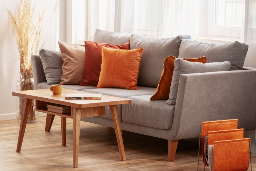
Russet brings warmth
Brown is another color that’s here to stay in 2022 fall color palettes. With a deep red undertone blended with warm and earthy brown, russet shades are a compatible color for hues like cream, clay, and olive green. Mayflower Red by Benjamin Moore shows off how warm and vibrant these colors can be. Perfect for creating the perfect, cozy fall decor scheme, russet shades can be integrated seamlessly with your existing decor. Whether through pillows, blankets, or ceramics, this organic shade will offer a comfortable vibe to your space.
Many paint companies have shared their colors of the year as well as the new and beloved jewel tones that have been revolutionizing the palettes seen in interior design. So there’s plenty of inspiration to draw from, whether you want a more earthy and grounded approach to fall color palettes or prefer the vibrant and moody jewel hues trending this season. Try incorporating one of these new colors into your space this fall season to spruce up your traditional decor. And always remember to opt for a cozy and natural aesthetic to stay on top of the trend this year.