Behr has chosen Canyon Dusk as the color of the year for 2021, and it just radiates earthiness and harmony. This is unsurprising since, this year, designers are focusing on warmth, comfort, and vitality in their design schemes. So if you’re looking for a way to update your space, look no further than these warm and comforting hues that will look stunning in contemporary and rustic homes alike.

Behr’s color of the year: Canyon Dusk
A Behr creation that invokes harmony and earthiness, Canyon Dusk can be the perfect addition to any space. This soft tone blends muted tones of pinks and reds with warm, rich shades of subdued brown to create a neutral that’s gentle and elegant, adding much-needed tranquility to your space.
Reminiscent of the majestic and peaceful atmosphere of canyons at sunset, this color evokes the feeling of watching sunlight cascade over sand-colored stones, making for a stunning color that mimics the energy of a warm desert. It’s an excellent fit for people looking to incorporate more subtle earthy tones into their homes.
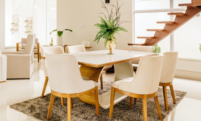
Since this color is all about being grounded and enjoying softness, it’s best to style it with a “less is more” approach. While you can certainly paint all four walls with this shade, consider incorporating it in lighter ways, purchasing throw pillows, wall art, rugs, or vases in the hue. We love the look of a painted mantel too, as it incorporates this trendy color in a more unique and classy way.

Focusing on a soft color palette
Aside from Canyon Dusk, many of the hottest home design colors this year evoke similar feelings of warmth, vitality, and comfort. Consider adding a few of these shades into your design for an earthy, neutral look that isn’t too boring.
Seaside Villa
Seaside Villa, much like Canyon Dusk, is a blend of pink, brown, and sand tones for a hue that’s warm, muted, and incredibly inviting. The color is a little rosier than Behr’s color of the year, adding pink, purple, and soft white undertones. This natural color makes us think of a shimmering pearl on the seaside as the sun sets over the horizon.
Incorporate this color in the furniture, vases, tables, and rugs for a clean, sophisticated shade that’s a little brighter and more feminine than typical neutrals.
Cellini Gold
For a rich statement color, try out Cellini Gold. This shade takes a more gentle approach to gold, creating a hue that’s browner than it is orange. This bold but neutral shade is certainly attention-grabbing, so we recommend using it for accent walls or large statement pieces like rugs and cushions. It’s best paired with warm browns and off-whites, like Behr’s 2021 Maple Glaze or Smoky White.
Kalahari Sunset
Kalahari Sunset is deeper and richer than the shades above, making it great for more intimate or lounge-like spaces. The depth of this color adds a touch of luxury too, so it’s a great option for homeowners looking for a more upscaled rustic design.
Royal Orchard
While most of the colors this year tend toward warmer hues, a few cooler shades add a little visual interest to the space and pull focus to certain pieces in the room. Pair your warm neutrals with colors like Royal Orchard, a velvety forest green color that can break up the beige, brown, and cream color scheme. If you have a solid wood dining room table, then we recommend painting the room with this hue. Deep greens and woody browns create a relaxing space that evokes the calmness of staring out over a wooded glen.
Jojoba
While neutrals are certainly on brand this year, don’t feel the need to follow the crowd. Bringing together deep greys like Behr’s Broadway with a gem tone like Euphoric Magenta can create a space that feels fun and lively. To tie it all together, though, you need Jojoba. This cool muted emerald balances out the deeper tones of the greys and purples. It may be more of a background feature, but it will certainly invite balance and airiness to your space.
This year’s paint color trends are all about inviting the outdoors inside with desert-colored neutrals and darker forest-inspired tones. Combining sandy neutrals with cooler accent colors creates a balanced space that you can dress up with ornate rugs and carved furniture or keep simple with contemporary single-toned pieces. Have fun mixing and matching your cool and warm shades to create a vibrant, exciting space, and, if you get the chance, try to include Canyon Dusk to keep it trendy.