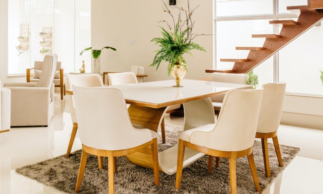
Interiors are trending toward more natural and sophisticated hues in 2025. A focus on warmth, organic hues, and luxe touches will influence many homes in the coming year, fostering cozy and inspiring spaces. If you’re eager to update your palette with the trendiest paint tones, we have every color of the year 2025, shared so far by the most notable names in paint.
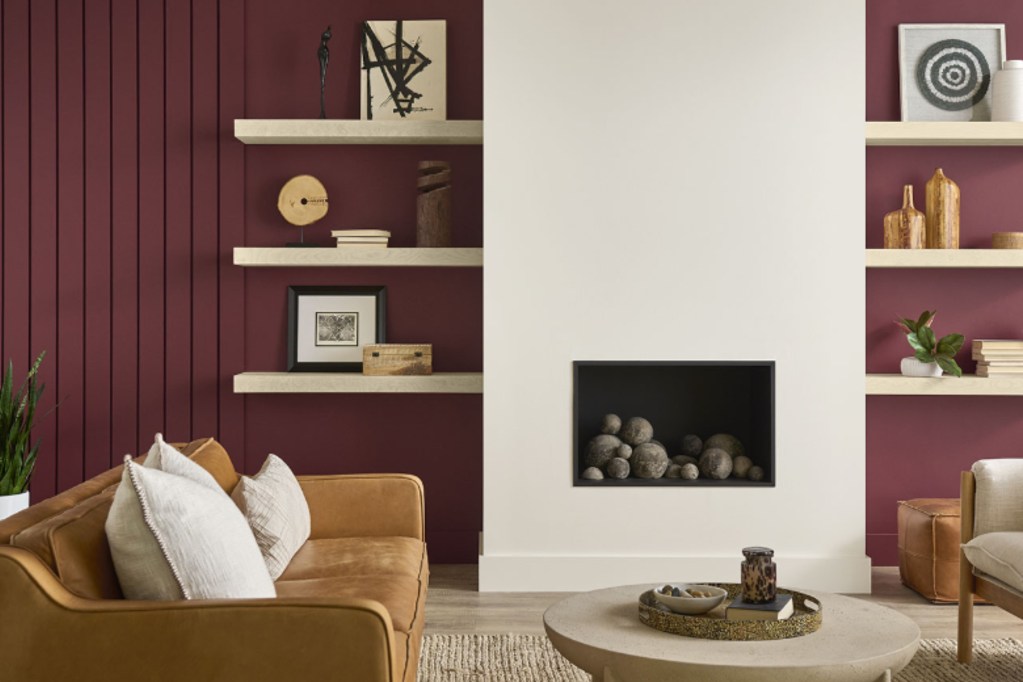
Benjamin Moore: Cinnamon Slate 2113-40

Ground your space this year with Benjamin Moore’s Cinnamon Slate. Described as “a delicate mix of heathered plum and velvety brown,” this hue is rich, sultry, and comforting. Cinnamon Slate invites a lush brown tone to your palette, with a gentle red-purple undertone that adds a soft flair to the space. Ideal in bedrooms and living rooms, this earthy color can be an exceptional way of adding organic flair and naturality to your home.
Keep your palette monochromatic by pairing this color with other warm neutrals like a deep chocolate brown or pale beige shade. Alternatively, make the brown stand out with muted green, deep burgundy, or mauve pink. Cinnamon Slate is all about balancing a cozy, natural aesthetic with a hint of luxury and sophistication.
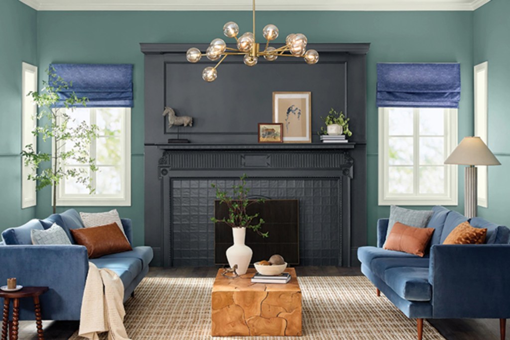
HGTV Home by Sherwin-Williams: Quietude HGSW6212
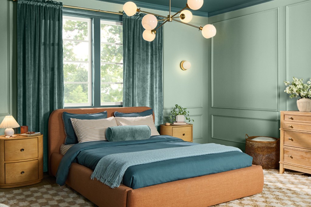
HGTV Home by Sherwin-Williams shares the iconic color of the year 2025, Quietude. Quietude is a pale sea green with just enough teal to make it unique and experimental. Its description considers it “a soft sage with a whisper of blue influence.” Quietude is a bolder tone meant to make a statement in soft, muted palettes.
This hue doesn’t adhere to trends; rather, it’s meant to offer a beat of solitude and tranquility to your space in a unique and timeless way. Pair Quietude with gentle tones like cream, pale yellow, or off-white. You can find Quietude through the HGTV Home by Sherwin-Williams brand, exclusively at Lowes.
Bonus: Sherwin Williams 2025 Color Capsule
Sherwin-Williams shares a color capsule with their 2025 palette line-up, including colors such as Grounded SW6089, Rain Cloud SW9639, and Mauve Finery 6282, all of which would provide a tranquil and relaxed look to your home.
Behr: Rumors MQ1-15
For 2025, Behr took a bold step forward, opting for a passionate, empowering, and earthy color. Behr’s Rumors is a warm, invigorating, and deep red hue with a hint of a slate or beige undertone that calms the fiery tone. Rumors is reminiscent of rich canyon colors at sunset. Its allure is vintage, regal, and awe-inspiring.
This ruby-red color pops along neutral backdrops of white and cream. Pair light-colored woods with Rumors to make your palette impress. Use Rumors in any space that would benefit from an emboldened touch. Offices, workspaces, and the kitchen suit it best.
Valspar: Encore 8002-45G
Valspar’s color of the year 2025 is Encore, a rich and decadent deep blue that flourishes in the home. Described as an “atmospheric blue” that provides a “joyful respite from the ebbs and flows of life,” Encore is meant to invite happiness and confidence to the home.
This energetic blue can be invigorated by bright whites and pale yellows. Or, calm it down with periwinkle or sage green for a more tranquil, oceanic aesthetic. Encore is perfect for living rooms, entryways, workspaces, or kids’ rooms, where joy and relaxation are a part of daily life.
Glidden: Purple Basil PPG1046-7
Glidden’s color of the year 2025, Purple Basil, is meant to wow guests and offer homeowners a soothing, elegant backdrop. Purple Basil is a soft, muted, and deep plum tone with a hint of chocolate to warm it up and offer a more subtle expression. It’s described as an expressive tone that is bold yet subdued enough to inspire even timid homeowners looking to take on the latest trends.
Purple Basil is intended to “unapologetically embrace the rich warmth,” and to capture the essence of vintage and maximalist trends entering interior design in the coming year. Add Purple Basil to bedrooms, bathrooms, and other intimate spaces where this warm, comforting hue can embrace you like a gentle, encouraging hug.
Dutch Boy: Mapped Blue 429-5DB
Mapped Blue by Dutch Boy is a muted, sage green color with a light, robin’s egg blue undertone. It is gentle, light, airy, and reminiscent of beloved classics like sea foam green. Mapped Blue offers a natural and organic touch to any space, bringing a biophilic look to your palette.
Paired with other natural colors like brown, beige, cream, tan, white, or blue, you can create the perfect biophilic haven. Add Mapped Blue to kids’ rooms, kitchens, or dining rooms for a lively and refreshing look.
The year 2025 is an experimental time in paint colors. Designers are looking for bold and empowering tones with a grounding accent or soft, gentle hues that provide an organic touch to your space.