While traditional Christmas color palettes tend to be filled with luscious evergreen, bright and vibrant red, snowy white, and the occasional glittery silver or gold, these colors can sometimes clash depending on your home’s current design. If you’re struggling to pull off the traditional color scheme, maybe it’s time to rethink how you deck the halls.
In this article, we’ll help you curate the best Christmas color palette for your room, no matter what color your walls may be.
For neutrals, go for red and white
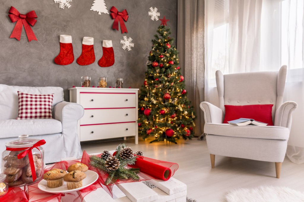
If you have a neutral color on your walls, like beige, cream, or gray, you might find that red and white decorations look best. White will make your neutral room feel brighter and more exciting, while red will hone in the holiday theme. Gray rooms, in particular, look stunning, adorned with red and white checkered pillows and stockings and a tree with white, red, and gold decorations.
A good tip for decorating with neutrals is that if your walls have cold undertones, adorn the place with more red and gold pieces. If your room has warm undertones, lean heavier on the whites and silvers. Either way, nearly all neutrals look great with red and white decor, from blankets to garlands, during the Christmas season.
For white walls, go with green and red

If you have plain white walls, don’t decorate with white or silver. These colors will blend into the background, leaving your design feeling empty and cold. Instead, use traditional greens and reds to decorate your space. For example, an evergreen garland on the mantle can bring new life to the fireplace. And red bulbs and ribbons on your evergreen tree can be warm and inviting.
Additionally, if you want to get more creative, gold decor and warm yellow lights will look beautiful against the white backdrop of your walls. Black accents are also an excellent addition for white rooms, especially when used on stockings, tablecloths, and blankets.
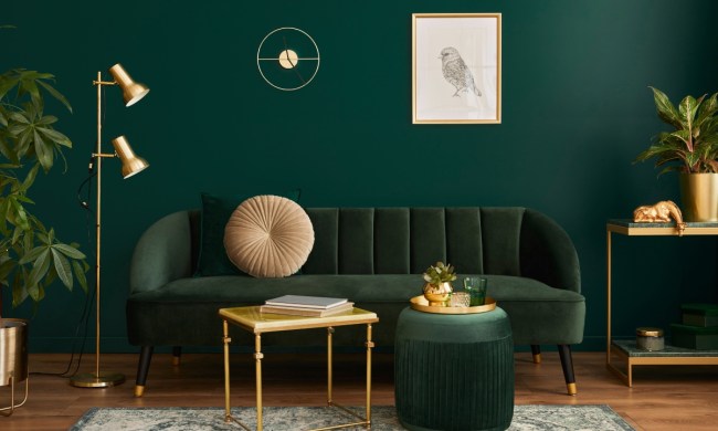
For earthy tones, choose green and silver
If your room adheres to earthy tones like warm browns, dark greens, or green-gray, you’ll do better to decorate with green and silver. If you have a light to medium green room, a dark evergreen will look natural and charming in the space. Use plenty of evergreen garlands and silver adornments to accentuate the earthy appeal of the room. You can use pops of red and gold to bring out the warmth of the palette.
Light to medium browns also look stunning when decorated with evergreens and silver. The evergreen decorations bring new life to the space, while the silver creates a cool accent. Pine decorations on dining tables or coffee tables also help transform the space for an ultra-earthy and natural look.
White and gold look great with blues
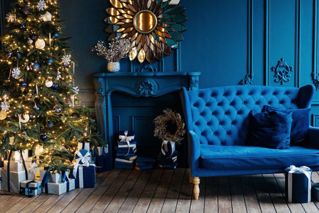
If you have blue walls in your home, white and gold will be the perfect addition to your Christmas color palette. White is a cool color that looks great with both pastel and rich blues and creates an icy wonderland dream during Christmas time. Hang white and blue stockings by the fireplace, and use a white and gold tablecloth in your dining room. Don’t be afraid to add more blues to your design as well. Blue pairs fabulously with different shades of itself and can help you create a stunning decorated room.
To offset this snowy white and icy blue palette, add a few gold ornaments and statues. Cold platters and dishware will be perfect for family gatherings. Or, add some gold-painted pots with white poinsettias for a lovely holiday arrangement. You can also use gold candelabras and a white tree with gold tinsel and bulbs for a sweet, wintery aesthetic.
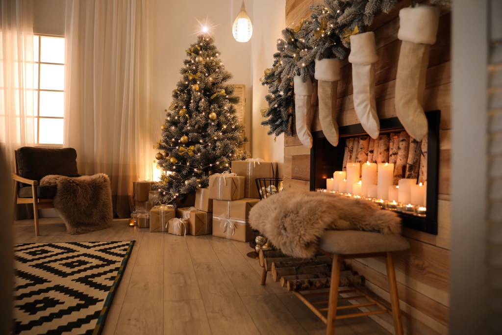
Dark rooms look beautiful with white and green
If you have a dark room like slate gray, rich black, deep green, or coffee brown, it’s best to decorate with white and green decor. Red can clash with some colors, so be careful when considering it in your design. In some homes, traditional Christmas red can still be used as an accent color. Alternatively, many homeowners with dark wall colors opt for yellow and russet orange instead of classic red. This creates a rustic, cabin-like aesthetic for the holidays that diverges from the norm.
However, it’s best to use traditional evergreen for dark rooms. Garlands draped on mantels or adorned atop dining tables look natural and appealing. Pair this with plenty of white accents, like poinsettias, pearly bulbs, sheer ribbons, and white dishes for a romantic and moody holiday look.
Rustic palettes look great with green, red, and gold
Homeowners with rustic color palettes may find that decorating with green, red, and gold tones is best this Christmas season. Rustic palettes often have dark brown tones and cool stone colors throughout the design. Using rustic designs, Japandi styles, and boho aesthetics, look best with deep evergreen and glamorous gold. If your home has a lot of deep browns, tans, subtle oranges, or warm gray tones, you’ll want to avoid any stark whites or cool-toned hues that throw off the warm and down-to-earth vibe you’ve spent so much energy to achieve.
Instead, use equally rustic decorations and colors to accentuate your existing design. Evergreen shades are perfect for adding Christmas flair while also adhering to an organic palette. Additionally, red, gold, copper, and bronze tones pair beautifully with more biophilic browns and natural elements, making these colors an excellent choice for a Christmas palette if you want your decor to stand out during the holiday season.
Pink and purple rooms benefit from rose gold, gold, and white

If your home has a pink or purple-based color palette, you’ll want to intersperse Christmas decor that is gold, white, or rose gold. Pink palettes with colors like canyon hues, mauve, or blush will benefit most from rose gold and gold decor. Add these colors to your Christmas tree with ornaments, or use bows in pink or gold tones to best blend with the existing palette. White snowflake decor is also stunning and adds a pop of color to your winter decorum.
For purple palettes that use plum, lilac, or velvet-purple hues, you’ll want to utilize matching purple ornaments, silver and gold accents, and white pops of color for an elegant and luxe look.
This year, it’s okay to break away from traditional red, white, and green Christmas color palettes. You can experiment with a few of these colors to curate a design that suits the aesthetic of your home. Be sure to balance your cool and warm tones, and don’t go overboard with any one color. Dispersing these colors across the decor of a room can help you create a space fit for the holidays and plenty of family gatherings to come.