If you’re looking for the perfect neutral to add to your space, taupe is a fantastic choice. With its warm undertones and delicate coloring, taupe can ground your design and add an elegant flair that you can’t get with other neutrals like creams and beiges. Unfortunately, many homeowners are unaware of just how diverse and sophisticated taupe can be. To give hesitant decorators a starting spot, we’ve gathered some of our favorite taupe colors to show off just how gorgeous this hue can be.
What color is taupe?
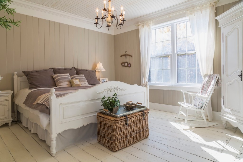
Taupe can appear both beige and grey, but don’t mistake this neutral blend for its sister color, greige. Taupe has a darker and richer undertone of brown or tan and often has hints of mauve, adding a little more depth to the shade. Where greige tends to be very light and more muted, taupe is a deeper, warmer color. On the lighter end of the spectrum, taupe can also appear to have more elements of cream, but the brown, purple, and green undertones make it more saturated than the classic neutrals.
Best taupe colors
Waynesboro Taupe 1544 by Benjamin Moore
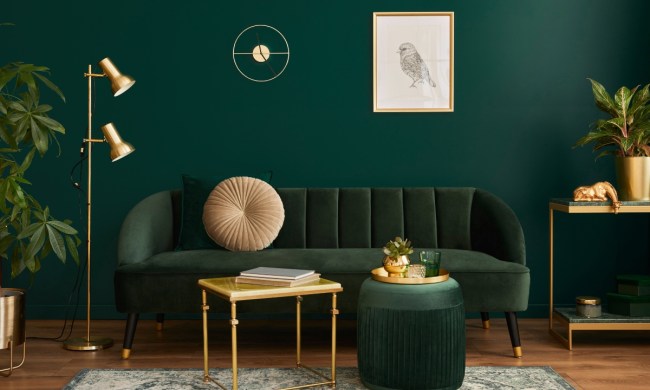
If you’re looking for a rich taupe, look no further. Waynesboro Taupe by Benjamin Moore is the perfect earthy and warm grey hue. This shade leans into its brown undertones while also incorporating a subtle yet sophisticated violet to create a luxe, vibrant color. Pair this beautiful taupe color with warm leather accents and dark metallic pieces for an upscale modern look, or lean into shades of dark forest green and lilac for a subtle, mid-century aesthetic.
Sherwin-Williams Gossamer Veil (SW 9165)
Not all taupe colors are dark or overly saturated. Others, like Sherwin-Williams Gossamer Veil, are much lighter and more subtle, making a great backdrop to cottage-style or farmhouse homes. Created by blending light creams with a soft grey, Gossamer Veil is the perfect way to create an airy feel in your space, presenting a clean backdrop for a colorful living room, entryway, or basement.
If your style is more dark and moody than light and airy, pair this taupe with rich navy blues, deep purples, and steel greys to enhance the subtle cream undertones.
PPG’s Taupe Tapestry (PPG1072-4)
Taupe is the perfect combination of hued and neutral, as the variety of undertones allow it to blend seamlessly in nearly any design. But for a shade that’s a bit more colorful than its counterparts on this list, try PPG’s Taupe Tapestry. This lustrous shade is a radiant, “teddy bear beige,” complete with warm neutral brown and heavy mauve undertones. While this mid-tone taupe is a lovely choice for an accent wall, bedroom, or casual sitting room, you can also paint it as a backdrop for warm yellow or pale blue accents and furnishings. For a more energetic space, like a kid’s room, guest room, or bathroom, combine this taupe shade with coral or teal-toned accents.
Glidden’s Dovetail Grey (20YY 49/071)
Glidden’s Dovetail Grey is a subtle muted tone that aligns more with the beige family. This muted beige shade with light cream and grey undertones is best suited for spaces where relaxation and subtlety are paramount. Dovetail Grey is ideal for offices, kitchens, and bedrooms, especially when paired with deep steel and charcoal grey tones or rich browns and mahoganies.
Behr’s Taupe Tease (N210-1)
Taupe Tease is a soft and creamy shade with pink undertones, creating a more romantic hue that’s breathy and reminiscent of warm linens. In kids’ rooms, bathrooms, or living spaces, pair this color with pale pinks and blues to highlight its youthful nature. Or, opt for a moodier color palette by complementing Taupe Tease with rich beetroot or purple jewel tones. Dark forest greens and vibrant brown shades can also create a nature-inspired aesthetic, especially when the space is filled with lush greenery.
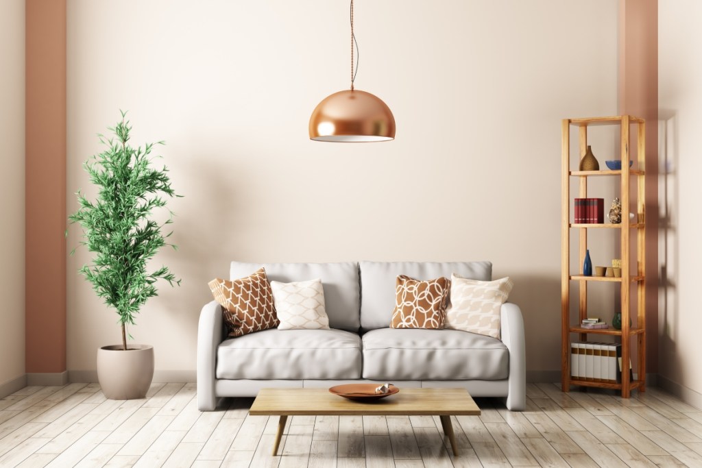
What color goes well with taupe?
The perfect complements for taupe depend on the undertone, saturation, prominence, and sheen of the paint in your design. That being said, this versatile shade is easy to pair with nearly any color story, so it won’t be difficult to pick your perfect palette.
Do you prefer vibrant and energetic spaces that inspire creativity and socialization? Opt for bright, saturated colors that add much-needed brightness to the taupe’s deep, neutral undertones. For romance and tranquility, lean into the warm pinks and purples to pull out the floral hues in this trending tone. If you’re a fan of modern minimalism, stick with deep greys or off-whites to make the subtle coloring of taupe stand out ever so slightly. As a smooth and brown-heavy color, this beige and grey combination can be the perfect neutral backdrop for any space, whether it’s luxe and shiny or maximalist and cozy.

