Cream is an elegant and timeless color that can easily make a room feel warm and bright. Sitting just between yellow and off-white, cream paint pairs well with bold hues in large spaces but can also stand alone to create a serene vibe in smaller ones. Regardless of your chosen design aesthetic, you can find a cream paint color that works for you. Whether you’re considering a remodel or just a quick refresh, cream may be the way to go. If you’ve been searching for the perfect neutral hue that is classic, warm, and inviting, check out these cream paint colors that are sure to elevate your next redesign.
What colors are in cream?
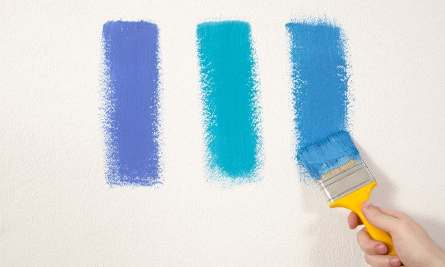
At its most basic level, the color cream is a combination of yellow and white. However, if you’ve been shopping for cream paint, you already know it is far more complicated than that when you’re face to face with dozens of differing paint swatches. These days, there are thousands of different shades of cream, with each one bringing something slightly different to the table.
Some shades include hints of gray and green while others incorporate tints of blue and purple. Cream is much like grey in this area — you can find a shade with undertones of just about any color imaginable. That being said, you shouldn’t let the sheer number of choices overwhelm you when it’s decision time. As long as you keep lighting and decor in mind, and trust your instincts, you’ll find a cream paint color that works for you. And, if all else fails, ask a sales associate or professional designer for guidance. Keep in mind, the color you love at the store will look different when you get it home.
Cream vs. beige: What’s the difference?

Cream and beige are similar colors that can sometimes be used interchangeably. However, they are each unique variations of light neutral tones and are not necessarily the same. Cream hues tend to have lighter white or yellow undertones, while beige often has brown undertones. Both beige and cream can appear cool or warm-toned, but cream tends to be warmer than most beige hues.
Cream can be the perfect go-to if you want a warm, light neutral with subtle undertones. Alternatively, if a sandier, cool-toned neutral that feels cozy and grounding is what you need, we recommend choosing beige.
What are the best shades of cream?
Natural cream
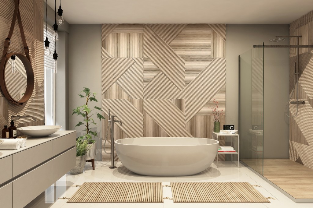
Natural cream is a mix of grey, yellow, and white, ultimately resulting in a hue that’s similar to a muddy greige. Benjamin Moore has a specific shade called Natural Cream, but you can find similar colors from several different paint manufacturers. This shade works well with tranquil environments due to its light and airy elements, but the cleanliness also lends itself to more sophisticated, professional spaces. You don’t have to worry about the personality of the room either, as natural cream colors work with almost any decor style from the dining room to the den.
Yellow-heavy cream
Cream-colored paint is both warm and neutral, which is why these shades work well in so many different settings. Cream tones work in just about every room of the house and within any home style. Since paint colors vary greatly based on the light in the room, it’s nice to have the reassurance that any cream paint color you pick will feel warm and inviting. There isn’t a one-size-fits-all cream paint for every room in every home, but more yellow-heavy shades like Swiss Coffee from Benjamin Moore and White Tie from Farrow and Ball are just about guaranteed to give off warm vibes, especially when paired with other warm colors.
Which colors match best with cream?
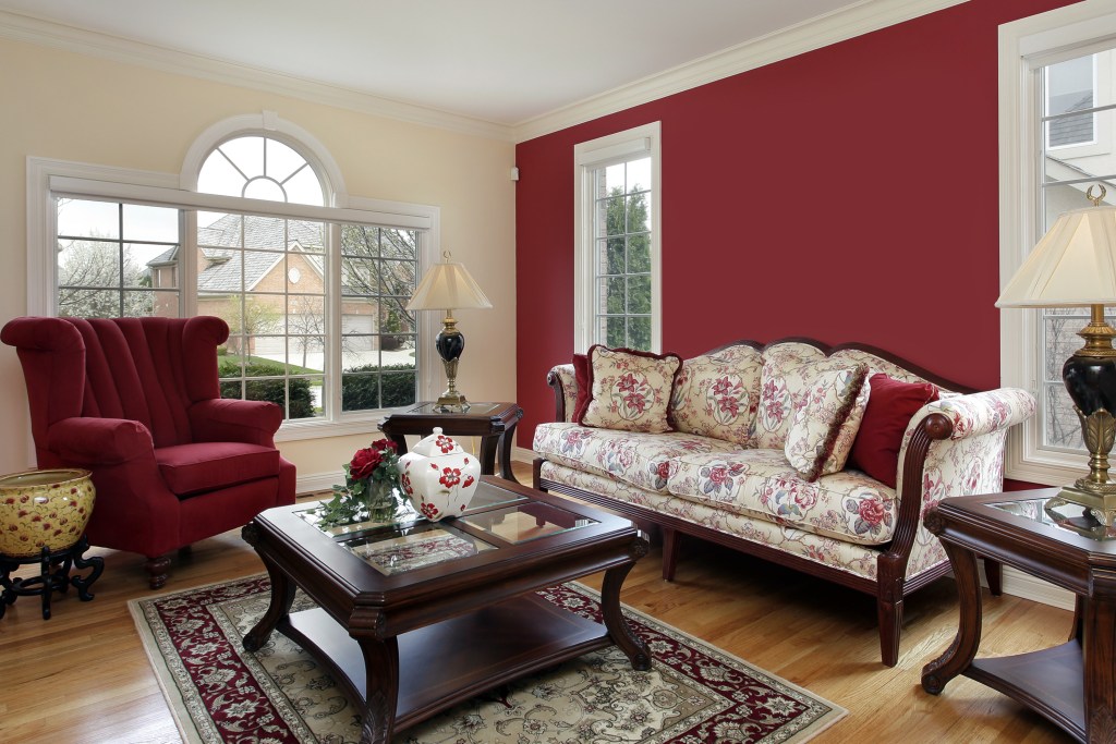
One of the best things about cream paint is its versatility. It’s neutral, so it won’t clash with bright colors or bold patterns, but the yellow undertones ensure it’s more relaxing than a stark white. Cream walls pair especially well with warm reddish browns, earthy colors like rusty oranges and reds, cool greys, black, soft shades of purple, icy blues, and several shades of green. While you wouldn’t put all of these colors together in one room, the possibilities of incorporating a few of your favorites are pretty much endless.
Whether you are completely redecorating a room or just want to freshen up the decor, the perfect shade of cream is waiting for you. Need inspiration? Consider pairing Farrow and Ball’s Slipper Satin with black, red, and brown accents in a living room or Sherwin-Williams’ Alabaster cabinets with white subway tiles for a monochromatic kitchen. For contemporary and rustic homes alike, there are endless ways to create a fresh, exciting, and inviting atmosphere with a coat or two of cream paint.
Cream walls in your home can evoke feelings of warm coziness or elegant sophistication, depending on the shade and accompanying decor. As one of the most flexible paint colors, this neutral shade is lively on its own but also pairs well with your favorite accent hues and patterns. Open up a small space by painting the ceiling a shade of cream, make your kitchen look Food Network-worthy with crisp, clean cabinets, or give off a cool vibe by accenting this neutral with jewel-toned greens in a bathroom or office. The bottom line is if you’re looking for an incredibly adaptable paint color for the interior of your home, cream is definitely the way to go.