Want to level up your wall decor? We love this interior designer’s trick for blank wall space

Try this clever tip for tackling blank wall space in your home

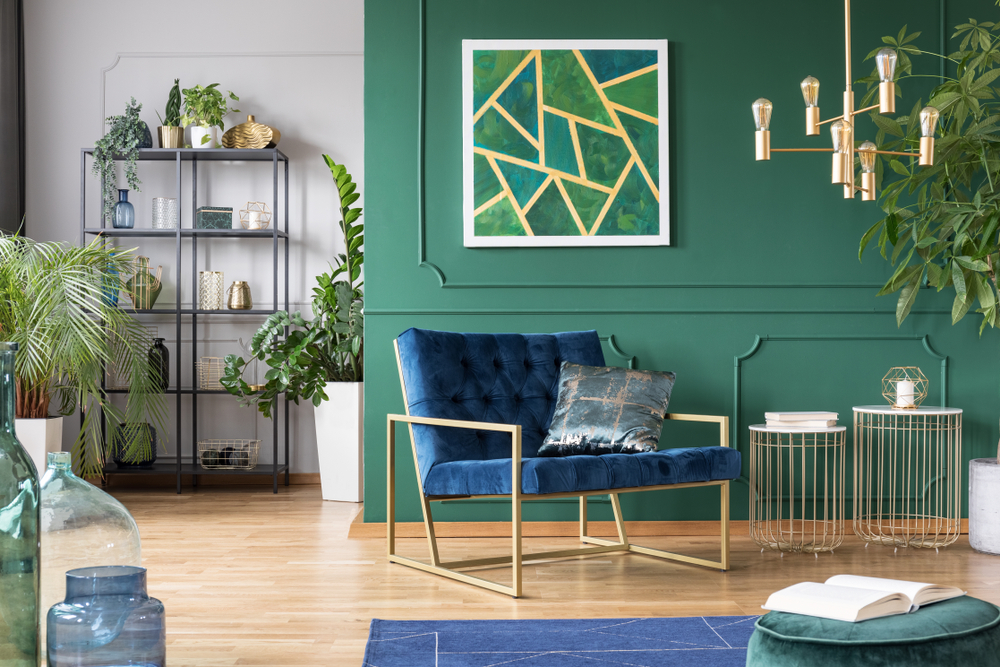
green living room with gold accent pieces
Ground Picture / Shutterstock

A common struggle for many homeowners is decorating a wall without making it feel too cluttered or, worse, too empty. Too much negative space can leave a room feeling unfinished, lackluster, and downright visually unappealing. Thankfully, Julie Jones, founder of Julie Jones Designs, took to TikTok to share a fantastic design trick for dealing with blank wall space by using a clever rule for your wall decor.

@juliejonesdesigns

#interiordesign #designer #blankwalls #designtips

♬ original sound – Julie Jones Designs

Try the 70/30 rule

Interior designer @juliejonesdesigns shared her trick for handling blank wall space with a unique rule that works for nearly any wall. “I have a 70/30 rule,” Jones says in her TikTok video. She explains that the rule means 70% of the wall needs to be filled with positive space while the other 30% can be negative. “It’s a really easy formula that you can apply to almost any wall.”

Recommended Videos

In her video, she shares examples of how 30% positive space can leave a room feeling blank and visually unappealing. For example, a single large clock mounted on a wall leaves too much negative space that can feel visually empty and bleak. However, a wall with a large portrait, decorative shelf, and small table will make the area feel more complete.

Regarding the 70/30 rule, Jones says, “It’s just enough to feel balanced and not notice any negative wall space.”
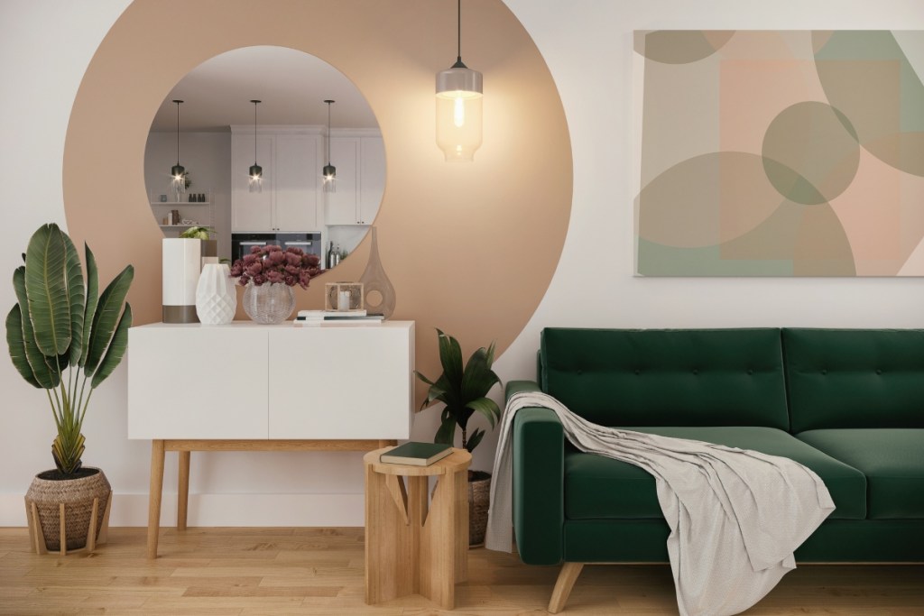
Neutral and green color palette for living room design
Aleksandra Zlatkovic / Getty Images

How to apply this trick

There are a few ways you can easily apply the 70/30 rule to your home design. First, opt for large pieces like a grand clock, big artwork, or a larger bookshelf. This piece can become the focal point of the wall. It’s also an excellent opportunity to add a statement piece to your design or experiment with accent tones and artistic wall decor.

Once you have your central piece, adorn the wall around this item to create 70% positive space. This could involve adding a potted plant, a small side table, a bench, or additional shelving to create more positive space.

It’s important to avoid cluttering the design by adding too much positive space. Unless you are going for a more maximalist look, it’s best to aim for around 70% positive space.

When decorating a tall wall

Applying the 70/30 rule to an abnormally tall wall with high ceilings can be tricky. Adding all of your wall decor at the bottom might still result in a flat or blank design. Instead, attempt to center a large piece of artwork or tall bookshelf to occupy much of the space. Or, stack three large paintings or photos vertically to add to the 70% positive space in your design.

When decorating a long wall

Consider using large frames in a row down the middle for abnormally long walls to occupy the space. Alternatively, you can use long mirrors or an extended shelf to become the center of your 70% positive space. Add benches or long side tables in the center to prevent the wall from feeling too blank and lackluster.

Decorating a blank wall can be easy if you follow this trick from Julie Jones Designs on Tiktok. The 70/30 rule is great for anyone struggling to find visual balance with a wall that seems bleak and empty. Just be sure not to overcrowd the space, and use this trick to tie together your color palette and any accent pieces you’d like to bring to your interior.

Amelia Wilson
Amelia Wilson (author pen name Amelia J. Wilson) is a content writer in Greenwood, IN. She often enjoys topics on…
11 designer-approved coffee table decor ideas you’ll want to borrow
Here are interior designer-endorsed ways to accent your coffee table
Coffee table decor

When redecorating or sprucing up a living room, consider getting a coffee table. It is one of the most noticed -- as well as used -- pieces of furniture in that area. Coffee tables come in a wide variety of shapes, sizes, and materials, so the sky is the limit when finding one that fits your personal style. They can also make a big statement in a neutral space and draw your eye in.

“Using decorative accents on your coffee table is a simple yet impactful way to add style to a room,” Gavin Brodin of Brodin Design Build explains to 21Oak. He points out that once you style a coffee table, you can easily restyle it to reset the overall mood of the space -- seasonally or any time of the year! Here are eleven interior designer-endorsed coffee table decor ideas, and we love them all.
Coffee table decor ideas you'll love

Read more
This unique wall design will make you rethink wallpaper
Wallpaper frames? An interesting concept to consider for your home
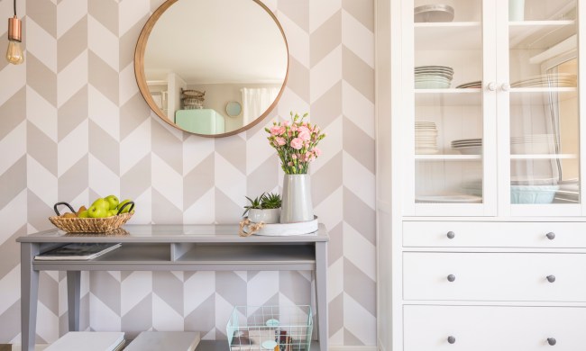
Geometric wallpaper with a console table

Wallpaper is becoming trendier in today’s home design, but some people aren’t ready to take the leap and wallpaper an entire room. This DIY project shows how you can add more visual appeal to a room using wallpaper ideas like creating individual "frames."
How to create this framed wallpaper look
@olivebranchcottage on Instagram shared a neat DIY wallpaper idea that she calls "wallpaper rectangles." This fun twist on adding traditional wallpaper to a room helps add visual appeal without being overwhelming. Here’s how she did it.

Pick your wallpaper
First, @olivebranchcottage suggests picking your wallpaper. In the nursery she designed, she opted for a black-and-white pattern depicting nature scenes.
Choose your trim
To create the "rectangles" on the wall, you’ll want to choose some wood trim. The creator chose some from The Home Depot.
Paint the trim the same color as the wall
Next, you’ll want to paint the trim the same color as the wall tone. This creates a greater sense of flow once you add the wallpaper.
Use painter’s tape to outline your design
@olivebranchcottage used painter’s tape to outline the design. This makes it easy to move pieces as needed and readjust until you find what is right for you. Also, she notes that the size and spacing of your rectangles are entirely up to personal preference. For the nursery, @olivebranchcottage placed the tape 5 inches from the ceiling and 5 inches from the baseboards.
Add your wallpaper
The creator suggests using a laser level to keep things even and straight as you place your wallpaper.
Cut your trim pieces
To cut your trim pieces, measure them to the same length as the painter’s tape you used for outlining. The Instagram creator says a 45-degree angle is best.
Use a nail gun to attach your trim pieces to the wall
Using a nail gun, attach your trim pieces to the wall. You should do this after you’ve laid your wallpaper. It’s OK if the wallpaper goes beyond the painter’s tape outline you created.
Cut the excess wallpaper
Once you attach your trim pieces to the wall, you can use an X-Acto knife to cut off the excess wallpaper. After you cut all the edges, you’ll have a stunning wallpaper design.
How to style framed wallpaper in a room
Styling the framed wallpaper is up to personal preference.

Read more
Cringe-worthy decorations that definitely ruin good home design
Experts say these are some of the most common design mistakes that ruin your home's interiors
Woman placing a pillow on bed for cohesive design

If you’re aiming for a stellar home design, then there are a few things many experts urge you to watch out for. Good home design is all about intentionality and ensuring that your design appears balanced through the use of color, texture, and form. So, to help alleviate any worries and to save you from a cringe-worthy design, we’re offering a few tips on how you can decorate your home to achieve a stunning look.
Uninspired, boring artwork

One of the most common aspects of bad interior design is adorning your walls with uninspired, boring artwork. Artwork is a great way to express your personal style while also adding color and character to your room decor. For homeowners in need of decorating a blank wall or who crave more visual interest, artwork can be a fantastic solution. However, it’s easy to pick out any old piece to style your space quickly. But doing so can sometimes leave your design feeling cheap or poorly planned.

Read more