While there are certainly minimalist styles that are super trendy right now — Japandi, anyone? — there’s something to be said for maximalism. Gorgeous saturated jewel tones, tons of texture, and busy wallpaper and backsplashes? All have the ability to inject your personality into your home, transforming it from a dull, drab space to one with all of the charm of — well, you.
Of course, the tricky thing about maximalism is knowing when you’ve gone too far. When does a gorgeous green wallpaper go from a feature statement to garish and tacky? How can you decorate with your maximalist wallpaper so that your whole room feels like it was designed by a pro? Reddit has you covered.
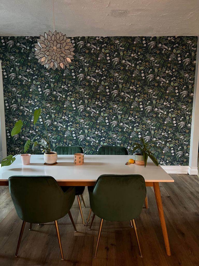
Redditor grandfatherpigo recently posted the above picture to the r/HomeDecorating subreddit, asking fellow Redditors how best to design around this nature-inspired green wallpaper from Rifle Paper Co. Here are the internet’s best answers. Read on if you’re in need of a little inspiration for your own space (or if you just want to see if your design pick made the list).
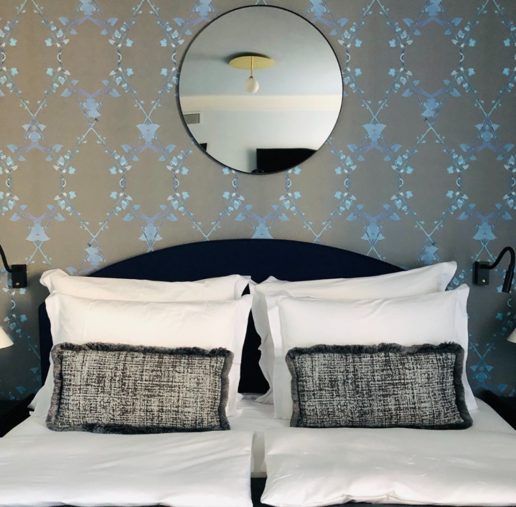
A mirror
This was one of the most popular answers and it’s not hard to see why — whether a single statement piece or a gallery wall full of mirrors, this classic decor helps give off the appearance of more space and light, and it fits in well with the established aesthetic.
Redditor Various_Bat3824 noted, “For me, the pattern is a bit overwhelming. A large mirror with a gold frame would give my eyes a place to relax. Or a grouping of four mirrors in a large square formation with lots of space between would be nice as well.”
KittensMagoo added that “long, rectangular gold framed mirrors” would work as well.
Gold accents
As is probably apparent from the mirror discussion, gold frames and accents were a hot topic of conversation. Of course, it doesn’t end at just mirrors.
“Mirror frame, sculpture, sconces, whatever… but gold for sure!” said Redditor MayorCleanPants.
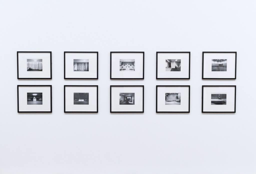
Black and white decor
While many loved the idea of gold accents to go with this green wallpaper, black and white is also a classic combination — and one that goes well with gold.
“I was thinking three prints, mostly white space with some minimal black line art (or another color line art if you want some contrast against all the green),” said happypiggo. “Maybe gold frames?”
Redditor turquoisebee added, “I think something with a large mat, so that it reduces the visual busyness… I could see adding two-three pictures/paintings, with white frames and large white mats. It might actually add a bit of calm. Something like black and white photos might be nice.”
Accent furniture
Not only does furniture break up maximalist wallpaper, but it creates more storage space as well. Grandfatherpigo confirmed that there’s not a lot of space between the wall and the table — it’s essentially a small walkway — but Redditors were undeterred.
MeddlingMoose suggested, “A short credenza under [a] mirror would ground it a little too if there’s enough space. [You] could even add some simple vases [and] books on top with a pair of bronze sconces on either side.”
Acrobatic-Video6418 added, “You should put a light color or white cabinet with a mirror above it. The wallpaper needs some layers of decor to make it relate to the interior as a whole.”
As for the space problem, ObiWanCombover said, “Maybe try a really narrow console table? You could probably find one under 10″ deep because they’re so often in tight spaces like hallways and entryways. A nice mirror above and some curated decor on top would be lovely.”
Redditor Eikobot added that a small console table “would also help pull the green chairs from the wallpaper visually.”
Molding
Redditor cocorego reported they have the same wallpaper in their own home — though in a much smaller space. “You could add some molding along the middle of the wall that also functions as shelving,” they said. “This would break up the wallpaper a bit; plus, you could then add some art above it and candlesticks, etc., on the shelf of the molding. I’ve done this as well on a wall in my kitchen.”

Leave it alone
Part of the beauty of maximalist wallpaper is that it gets to be big, loud, and in your face.
“I love this as is!” said 55pennycandy.
Intelligent-Metal205 agreed: “Seriously. It is a busy pattern and a beautiful one. Adding things to it will only create more stress to the eye — that’s why it’s a great stand-alone focal point.”
This green wallpaper is a great example of a maximalist feature in a home that mixes modern and vintage decor. Whether you prefer to mute your maximalist wallpaper in a subtle way or let it shine, there are plenty of great ideas here you can incorporate into your own design.
