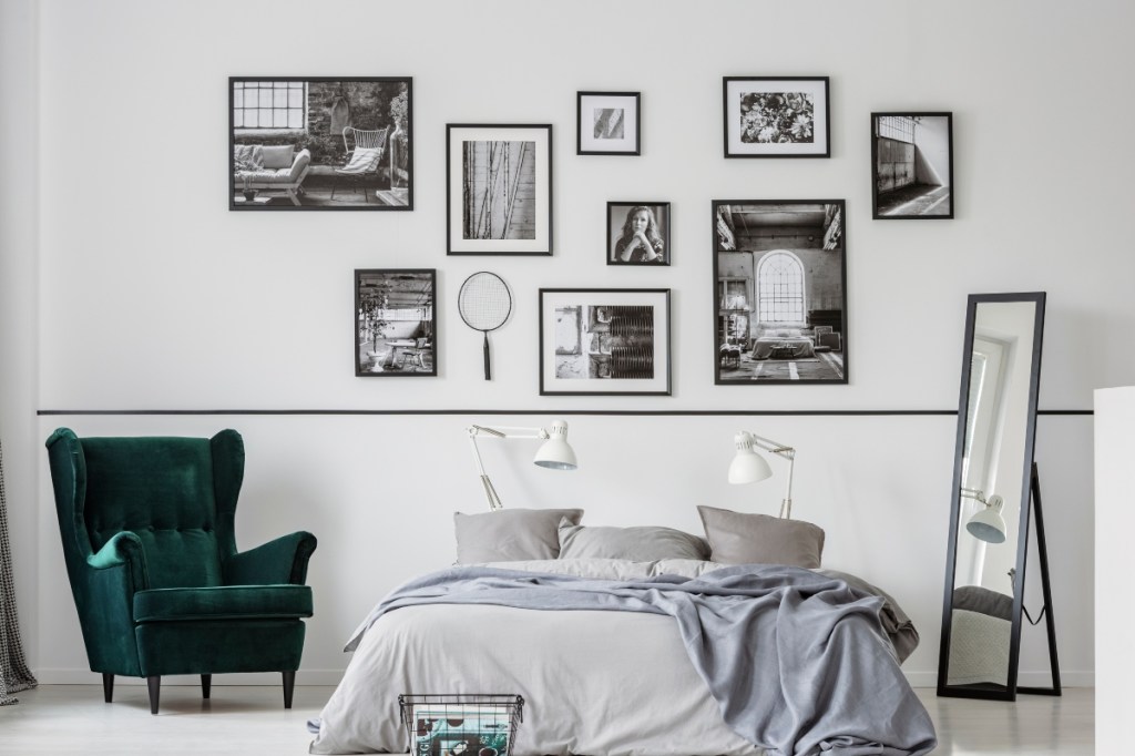
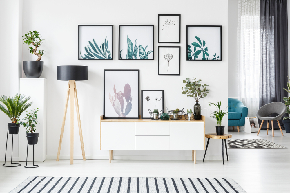
If you have a large wall and you want more from it than just a space to hang a single framed piece of art or mirror, gallery walls are the way to go. If you’re not familiar with the concept, a gallery wall is a combination of pictures, frames, decor, or prints hung in one central space. They pack a ton of punch when it comes to character and texture on your walls, and they can be an ideal place to showcase your favorite photos and more.
If you’re considering a gallery wall and don’t know where to start, we have experts that are here to help. While it may seem fairly easy because you’re hanging a collection of items, there are some general rules to keep in mind to make sure it looks polished and put together.

Don’t begin hanging decor up until you know what you’ve got
One common mistake is to start a gallery wall without a solid plan for how large you want it to be or how many items you’ll be using. This can lead to too many or too few items being hung, which can throw off the look of the wall. Saloni Ingle, an interior design architect at Nitido Design, says first things first when hanging either a set of prints to go into a gallery or various items you bring together on your own.
“Begin amassing a collection of your favorite items, such as original paintings, handcrafted prints, and photographs,” she advises. “Consider the size of your potential collection as well as the layout you desire as you begin collecting.”
If you don’t have a good idea of the scope, it’s hard to measure it out correctly. Ingle said a good place to start if you’re unsure is to “measure the length of your wall and spread out your collection on the floor. Take a step back and take a look at them all at once” to make sure the arrangement looks even.

Don’t be afraid to let your personality show
Another common mistake is hanging too few pieces on the wall. A gallery wall is meant to be bold and daring and full of things that are meaningful to you.
“A gallery wall’s charm is that it can readily adjust to fill a large wall and make a statement,” Ingle explains. As such, it should be filled with pieces that are near and dear to you.
“Showcase artwork that has meaning for you or is a collection of your favorite pieces,” Ingle says. This can include framed photos from a family vacation, a piece of art you picked up on your travels, or a print passed down through generations.
Pay attention to height
Another common mistake to avoid is hanging your pictures and frames too high. “The first thing before hanging paintings and posters on the wall is to identify a location at eye level,” explains Natasha Frolova, an interior designer at Planner 5D. “It is the most appropriate option, as pictures hung too high are hard to make out, while hung too low, paintings and posters are difficult to percept.”
Ingle agrees and recommends hanging artwork “five to eight inches above a focal point such as a sofa, console, or sideboard.”
Consider symmetry in your design
Besides height, symmetry is also important. If you’re hanging paintings of the same size, “Symmetry is the key factor to consider,” said Frovola. “Paintings must be placed symmetrically” with “the same distance between each other.” She adds that “it is important to consider the size and shape of furniture to make all objects stay connected.”
If you’re hanging pictures of different sizes, Frovola says, you need to have the core element. That central piece “is in charge of the entire composition” and the smaller ones “obey” to fill out the rest of the wall.
A gallery wall is a stunning way to show pieces that are meaningful to you in an interesting and fun way. While you can hang matching pictures and frames, we love the idea of changing things up and adding frames in mixed metals and wood. This combination of different textures and colors makes the wall look and feel less formal (if that’s appealing to you). If you go this route, it’s best to hang an odd number of frames. If you’re looking for something more formal and uniform, try an even number of pieces in similar-colored frames.
The great thing about gallery walls is they speak to your individual personality and aesthetic. They are a great way to take up space and create a focal point in a living room or bedroom. They can be as colorful or neutral as you prefer; the goal is to feel good when you look at your wall.


